Graphic Communication: Logo Analysis
Part 1: Definition of Graphic Communication
Graphic communication refers to the visual representation of ideas, messages, and information through various graphical elements such as:
Images
Symbols
Typography
Layout
It involves conveying concepts or data in a clear, concise, and visually appealing manner.
Part 2: Examples of Graphic Communication
Infographics
Infographics combine text, images, and graphics to present complex information in a visually engaging format.
For instance, an infographic illustrating statistics about climate change might use charts, graphs, and icons to convey key points.
Areas of study: Communication graphics, Illustration, Typography, Multimedia, Interactive design (including web, app, and game)
Logo Design
Logos are graphic symbols that represent organisations, brands, or products.
They communicate the identity and values of the entity they represent.
Examples include the Apple logo, which symbolises innovation and simplicity, and the Nike swoosh, representing movement and athleticism.
Areas of study: Advertising and branding
Packaging Design
Packaging design involves creating visual elements for product packaging.
It includes the layout, colours, imagery, and typography used to attract consumers and communicate product features and benefits.
Examples range from the minimalist design of Apple product packaging to the vibrant and playful packaging of children's toys.
Areas of study: Package design
Advertisement Design
Advertisements use graphic elements to promote products, services, or ideas.
Effective advertisement design captures attention, communicates a message, and persuades the audience to take action.
Examples range from print ads in magazines to digital banner ads on websites, each utilising imagery, text, and layout to convey a compelling message.
Areas of study: Design for print, Motion graphics, Signage, Exhibition graphics
Part 3: How to Critique and Analyze Graphic Communication?
Historical Examples
Analyse designs from different historical periods to understand their context and impact.
Contemporary Examples
Study modern designs to see how current trends and technologies influence graphic communication.
Successful Campaigns
Investigate well-known branding and advertising campaigns to understand their strategies and effectiveness.
Design Failures
Learn from examples of designs that did not succeed to understand common pitfalls and mistakes.
Part 3.1: Sample Analysis Using Coca-Cola Logo
Historical Example:
Context
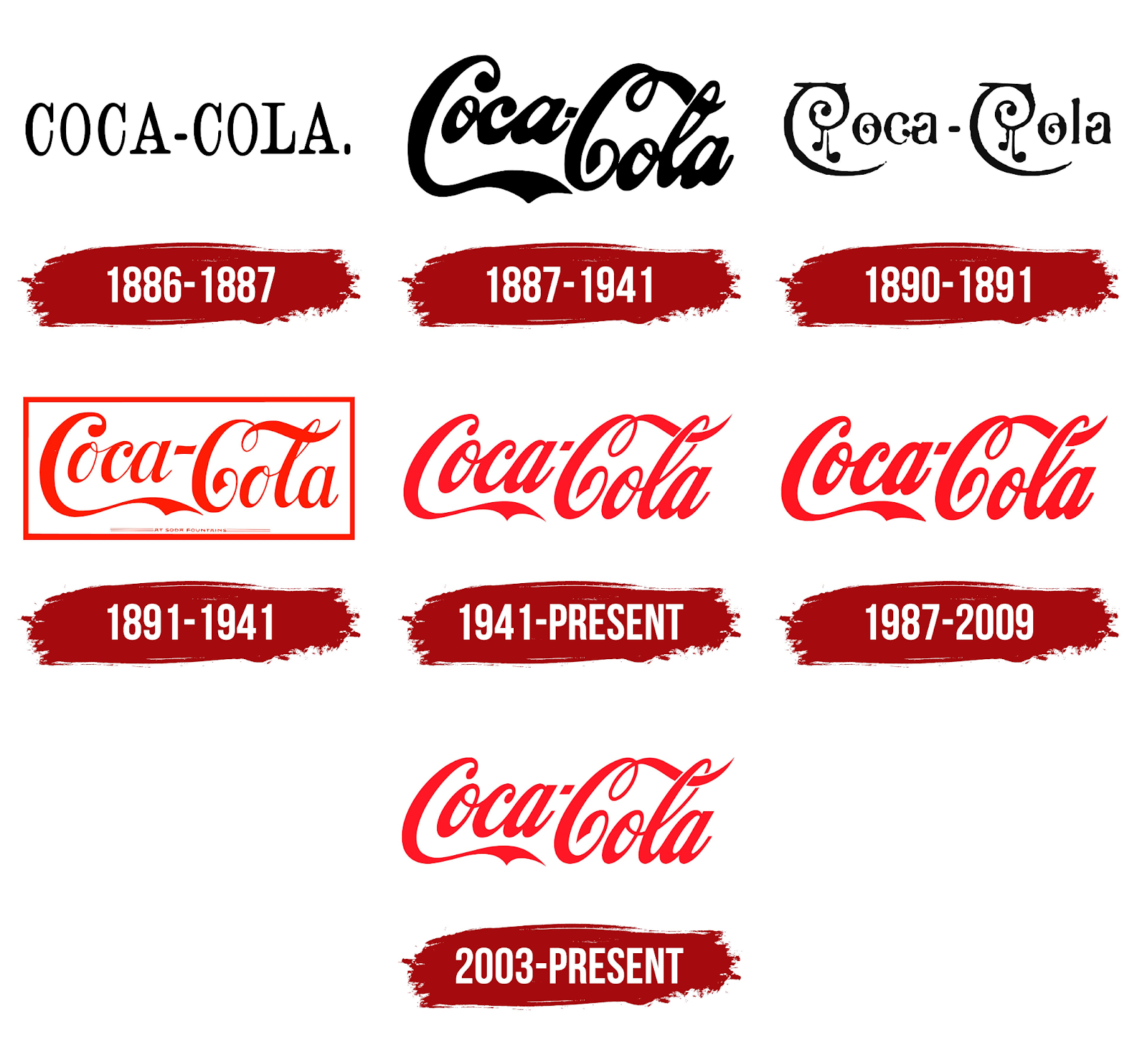
The original Coca-Cola logo was designed in 1887 by Frank Mason Robinson. It featured the Spencerian script, a popular form of penmanship in the United States during the late 19th century.
Impact
The logo has become one of the most recognized and enduring symbols in the world. Its introduction marked the beginning of a brand identity that would become synonymous with American culture and globalisation.
Design Elements
The flowing script and elegant curves of the letters conveyed a sense of elegance and sophistication, aligning with the brand's image as a premium product.
Cultural Significance
As Coca-Cola expanded globally, the logo remained consistent, becoming a symbol of Western culture and lifestyle.
Contemporary Example:
Modern Design
While the core design of the Coca-Cola logo has remained largely unchanged, there have been various iterations and adaptations to suit contemporary trends and marketing strategies.
Adaptations
The logo has been adapted for different campaigns, incorporating modern design elements such as minimalism and digital aesthetics.
Technological Influence
The use of digital tools and techniques has allowed for more precise and varied applications of the logo across different media, from print to digital platforms.
Current Trends
The logo often appears in limited-edition designs or thematic adaptations, such as holiday versions or partnerships with other brands and events.
Successful Campaigns:
"Share a Coke" Campaign
Launched in 2011, this campaign replaced the Coca-Cola logo with popular names on the bottles and cans.
Strategy
Personalised marketing to engage consumers on a more personal level, encouraging them to buy bottles with their own or friends' names.
Effectiveness
The campaign significantly boosted sales and social media engagement, demonstrating the power of personalization and consumer interaction.
Design Elements
The adaptation of the logo while maintaining brand recognition showed the flexibility and strength of the core design.
Design Failures:
New Coke (1985)
Coca-Cola introduced a new formula and logo in an attempt to refresh the brand and compete with Pepsi.
Pitfalls
The drastic change in taste and branding alienated many loyal customers, leading to a public outcry.
Design Elements
The new logo featured a more modern, blocky script that did not resonate with consumers accustomed to the traditional, elegant design.
Lessons Learned
The failure highlighted the risks of deviating too far from a well-established brand identity and the importance of understanding consumer attachment to brand elements.
Summary
The Coca-Cola logo serves as a prime example of effective graphic communication.
Its historical significance, adaptability to modern trends, success in various marketing campaigns, and lessons learned from design failures provide valuable insights into the importance of consistency, cultural relevance, and consumer engagement in graphic design.
The logo’s appeal demonstrates the power of a well-crafted brand identity that can evolve while maintaining its core essence