Chapter 2: Frequency Distributions
frequency distribution: an organized tabulation showing the number of individuals located in each category on the scale of measurement. places numbers in order, generally from highest to lowest (but other times lowest to highest, esp if done digitally), grouping together individuals with the same score. eg, if the highest score is X=10, the frequency distribution groups together all the 10s, the 9s, the 8s, etc.
it lets the researcher see the entire set of scores at a glance. also gives a good idea of where, if anywhere, scores are concentrated. also lets you see the position of any individual score relative to any and every other score.
structured as table or graph, but always has 2 key elements:
(1) the set of categories that make up the original measurement scale
(2) a record of the frequency, or number of individuals in each category
simplest form is a table with a column listing X-values and another column listing how many people had that X-value, generally labeled f per custom.
we always include all the numbers between our max and min X-value, even if there was no score of that value. eg, we don’t go from 6 to 4 just because nobody scored a 5.
“Notice that the X values in a frequency distribution table represent the scale of measurement, not the actual set of scores. For example, the X column lists the value 10 only one time, but the frequency column indicates that there are actually two values of X = 10. Also, the X column lists a value of X = 5, but the frequency column indicates that no one actually had a score of X = 5.”
Σf = N (ie, total number of scores in the distribution)
to obtain ΣX, remember to add the X-values the appropriate number of times, as dictated by the f-column (this process yields a value sometimes expressed as Σf X. just make sure to follow order of operations—eg, if you’re looking for ΣX2, you need to make sure you multiply X2 by the corresponding f-value, NOT X. alternatively, you can just list out all your X-values and do it manually, but that takes a LOT more time and effort.
frequency distribution tables might also use proportions or percentages to describe the distribution of scores!
proportion is generally calculated with — we just use a fraction of part over whole, usually using the resulting decimal for our table. proportions are sometimes also known as relative frequencies since they describe the frequency in relation to the total number. these columns are usually headed with p.
we can also use percentages, which are calculated with where p is the proportion. added to tables using % as a header.
“When scores are whole numbers, the total number of scores for a regular table can be obtained by finding the difference between the highest and the lowest scores and adding 1” :)
when a set of data covers a wide range of values, frequency distribution tables aren’t practical; instead, we turn to grouped frequency distribution tables, where we present groups of scores rather than individual values. the groups/intervals are called class intervals.
here are a few guidelines in order to produce a simple, well-organized, and easily understood table:
the grouped frequency distribution table should have about 10 class intervals— >10 = cumbersome, but <10 is too simple and loses too much info. note that it’s okay to have slightly more/fewer depending on your medium (printed in scientific journal, sketched on a blackboard, etc).
the width should be a relatively simple number, ike 2, 5, 10, or 20 (not something dumb like 7s). these numbers are easy to understand and let someone quickly see how you divided the numbers—there’s no puzzling. sometimes choosing is just trial and error—“how many rows could 2 give me? that’s too much; what about 5?” and so on.
the bottom score in each class interval should be a multiple of the width—eg, if your width is 10 points, the bottom scores should be 10, 20, 30, etc. again, it’s easier to understand.
all intervals should be the same width, covering a range with no gaps or overlaps.
generally, the wider the class intervals are, the more information you lose, so you should always go with the smallest logical interval possible.
be cognizant of real limits—for continuous scores, when you put them in this kinda table, you must still have real limits, eg “60-64” technically being “59.5-64.5”. the “60-64” is called an apparent limit because it appears to constitute the lower and upper boundaries for the class intervals, but they’re technically not. this also makes the intervals make more sense—60-64 doesn’t look like a 5-pt interval, but 59.5-64.5 most definitely does.
a frequency distribution graph is just… a graph of what you’d find on a frequency distribution table!
the x-axis is also called the abscissa (ab-SIS-uh), and the y-axis is also called the ordinate.
the general rule is that the graph’s y-axis is approximately ⅔ to ¾ the length of its x-axis
for measurements done on an interval or ratio scale, your 2 main graphing options are histograms and polygons:
histograms:
list the x-values across the x-axis, evenly spaced. draw a bar above each x-value so that (A) the height of the bar corresponds to the frequency for that category, and (B) for continuous variables, the width of the bar extends to the real limits of the category. for discrete values, each bar extends exactly half the distance to the adjacent category on each side. either way, the bars’ vertical sides should be halfway between the Xes. adjacent bars will always touch! you also do the same if the x-values are intervals—just label with the intervals.
a slight modification includes omitting the Y-axis, instead using gridded boxes to indicate amounts. each block represents 1 individual (although i assume there are sometimes differences noted by scales). this makes it easy to see the absolute frequency for each category.
%3Amax_bytes(150000)%3Astrip_icc()%2FHistogram2-3cc0e953cc3545f28cff5fad12936ceb.png&f=1&nofb=1&ipt=008ed9d8c24764438844273d8b8aafa03c830dea71fd2d036b1d7629128cdf0b&ipo=images)
polygons:
list the x-values across the x-axis, equally spaced. then, center a dot above each score so the vertical position of the dot corresponds to the frequency for the category. next, draw a continuous line from dot to dot to connect them. finally, complete the graph by drawing a line down th the x-axis (zero frequency) at the end of the range of scores. the final lines are usually drawn so they reach the x-axis at a point that is one category below the lowest score on the left side and one category above the highest score on the right side.
for interval and ratio scales, just center the dot directly above the midpoint of the class interval (you can find the midpoint by averaging the highest and lowest scores).
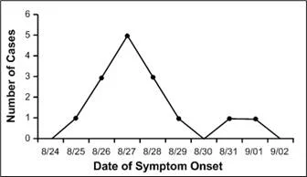
nominal and ordinal scales require different graphs called bar graphs! it’s essentially the same as a histogram except there are spaces between adjacent bars. this emphasizes that the scale consists of separate, distinct categories.
when you can obtain an exact frequency for each score in a population, you can construct frequency distributions that are exactly the same as the histograms, polygons, and bar graphs that are typically used for samples. there are times when that’s just impossible, though, and mote often than not, there are 2 main differences:
though we can’t always obtain the absolute frequency of sth in an entire population, we can often obtain relative frequencies. eg, you could have a bar graph without a labeled y-axis, just showing that one bar is slightly higher than the other to represent that there’s slightly more of thing 1 than thing 2.
when a population consists of numerical scores from an interval or ratio scale, it’s customary to draw the distribution with a smooth curve instead of connecting the dots like on a polygon. this indicates that you’re not connecting a series of dots (real frequencies) but rather showing the relative changes that occur from one score to the next. common one is the normal curve, defined as a specific shape that can be precisely defined by an equation. generally, these look like bell curves. the key features are that they’re symmetrical, with the greatest frequency occurring in the precise middle. when we discuss distributions of scores in the future, this is the graph we’re talking about.
we also often just describe a frequency distribution graph instead of drawing it! the 3 main qualities are:
shape: technically expressed by an equation, but also described by:
symmetrical distribution: it is possible to draw a vertical line through the middle so that one side of the distribution is the mirror image of the other; note that this does not have to be the standard bell curve but could be any xy so long as y is an even number
skewed distribution: the scores tend to pile up toward one end of the scale and taper off gradually at the other end.
tail of the distribution: the section where the scores taper off to one end
positively skewed/right-skewed: a skewed distribution with the tail on the right-hand side; eg, scores for a test that is very difficult
negatively skewed/left-skewed: a skewed distribution with the tail on the left-hand side; eg, scores for a test that is very easy
since not all graphs are cut-and-dry (some are approximately symmetrical, others are kinda half-way between symmetrical and skewed, etc), we can also qualify these statements by saying things like “roughly symmetrical” or “tends to be positively skewed.” the goal is just to provide a general idea of appearance.
central tendency: where the center of the distribution is located
variability: the degree to which the scores are spread over a wide range or are clustered together