Color Theory for Web Design
Understanding Color Moods/Messaging
Different colors evoke different moods and messages:
Red: Love, energy, intensity

Yellow: Joy, intellect, attention-grabbing

Green: Freshness, growth, safety

Blue: Stability, trust, serenity
Purple: Royalty, wealth, femininity
Choose colors that align with the messaging you want to convey.
Color Palettes
Analogous Palettes
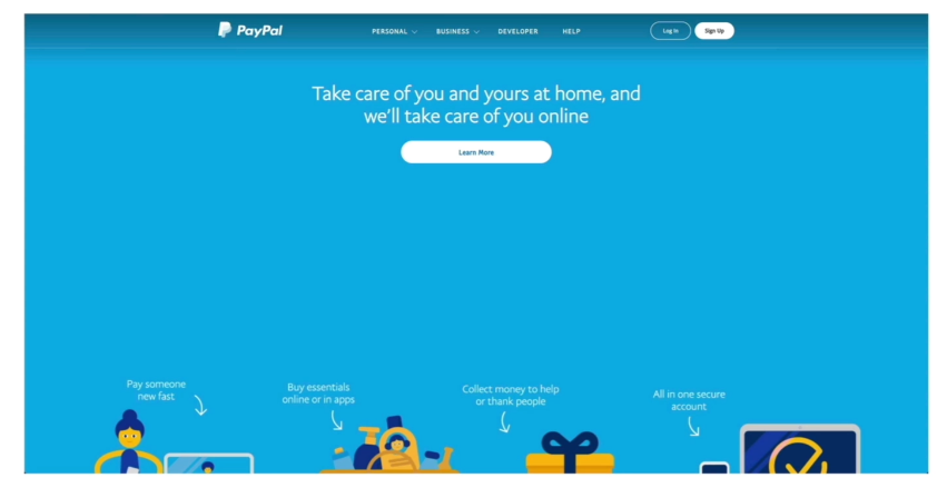
Using colors next to each other on the color wheel creates a harmonious, consistent palette. Good for user interfaces.
![]()
Complementary Palettes
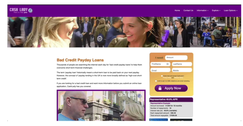
Using colors opposite on the color wheel makes each color "pop". Creates vibrant, high contrast combinations that draw attention.
![]()
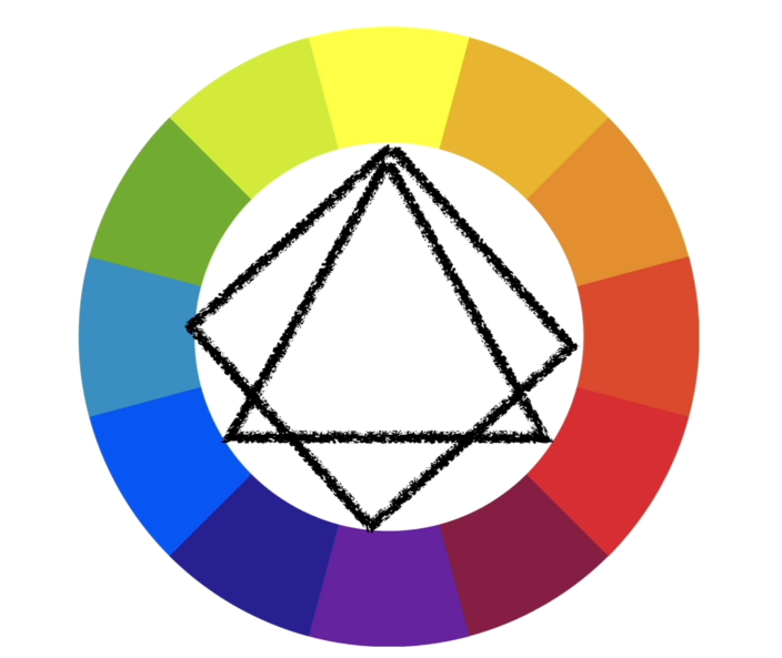
Triadic/Tetradic Palettes
Forming an equilateral triangle or square on the color wheel to pick 3 or 4 colors.
![]()
Palette Creation Tools
Adobe Color - Create and customize palettes based on color wheel positioning
ColorHunt - Browse pre-curated palettes from professional designers
Best Practices
Use complementary palettes for elements you want to stand out (logos, accents)
Avoid complementary colors for text/backgrounds as it can be harsh on the eyes
Pay attention to color mood/messaging and ensure it aligns with your brand
Aim for a consistent, harmonious palette across your design