1.1 Introduction to Maps
Map projections and the flat Earth idea
The video wraps up topic 1.1: Introduction to maps, focusing on map projections and how we display the Earth on a flat surface.
Columbus joke recap: Columbus claimed the Earth was round; crew complained because he kept using a flat map. This illustrates the core issue: the Earth is curved, but maps are flat.
Key statement: The only real way to accurately represent the Earth is with a globe; pocket-size globes don’t exist, so we use flat map projections to display a curved surface on a flat surface.
Mnemonic to remember distortion: "If a map lies flat, it lies." Flattening a curved surface always introduces distortion.
Projection defined: taking the spherical Earth and displaying it on a flat surface results in distortion in some way (like peeling an orange and laying it flat).
Distortion is inevitable because any curved surface is being represented on a plane; therefore different projections trade off what is distorted (shape, size, distance, direction).
Distortion trade-offs:
Conformal projection: preserves shape but distorts size.
Equal-area projection: preserves land area but distorts shape.
There are hundreds of map projections; the lesson is that there are many ways to depict the curved Earth on a flat surface. We’ll focus on a few famous ones.
Visual and practical emphasis: maps are selective in information; different projections suit different purposes.
Notable quote to remember: "If a picture is worth a thousand words, a map must be worth a million." (uses to motivate the idea that maps convey complex information, but with distortions).
Quick context: the current video previews future topics, e.g., geographic data (to be covered by Miss Neurath in topic 1.2).
Why maps need projections
The Earth is spherical; a flat map cannot perfectly represent a sphere without distortion.
Projections transform a curved surface to a plane, which inevitably changes some properties (size, shape, or both).
The goal is to choose a projection that minimizes the distortions most relevant to the map’s purpose.
Common map projections discussed
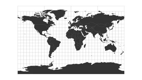
Mercator projection
Feature: lines of latitude and longitude meet at right angles (perpendicular grid).
Strength: excellent for navigation because angles are preserved locally (direction is reliable along lines of constant bearing).
Distortion: severe in polar regions; Antarctica and Greenland appear enormous; at the poles, distortion becomes extreme and Antarctica may be cut off from the map base.
Visual note: Greenland appears much larger than its real size relative to continents.
Example:
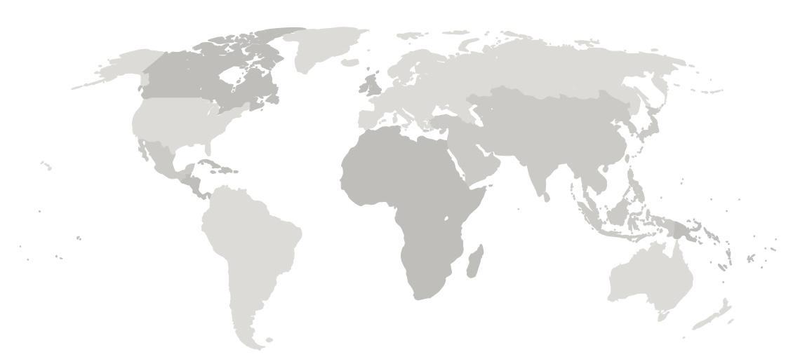
Gall–Peters projection
Characteristic: opposite of Mercator in terms of distortion; preserves area (equal-area).
Distortion: Greenland and Africa shapes are distorted; Greenland can look curved or stretched; Africa can appear relatively elongated/centered in a way that’s not typical on Mercator.
Visual metaphor: often described as looking like laundry hanging due to stretched landmasses.
Example:
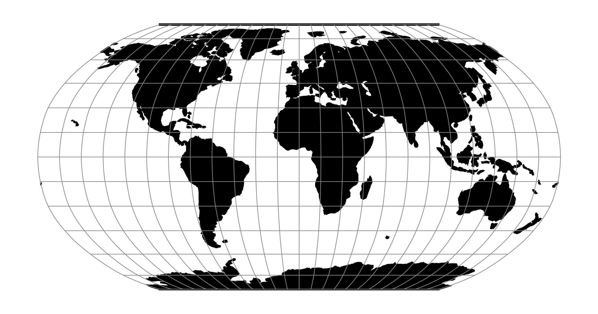
Robinson projection
Type: a compromise projection; attempts to balance size and shape more evenly across the map.
Polar distortion: improved relative to Mercator and Peters in the polar regions; not perfect, but more balanced.
Common use: widely used in atlases for displaying the entire globe with reasonable accuracy.
Example:
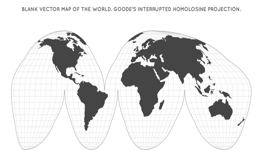
Goode’s (Goode’s interrupted) projection (Goode’s Homolosine projection)
Type: an equal-area projection that blends aspects of equal-area and conformal properties.
Special feature: interrupted (water removed in some regions) to better show land masses’ size and shape without tearing landmasses apart.
Common use: fallback in some textbooks; emphasizes land area rather than perfect shape.
Visual cue: interruptions around Indian Ocean, Atlantic, and South Pacific to minimize distortion of land shapes.
Example:
Distortion patterns and trade-offs (in depth)
Fundamental rule: projecting a curved surface onto a flat surface inherently creates distortion.
What gets distorted?
Shape (how the outline sounds like its actual shape).
Size (how large landmasses appear relative to each other).
Distance and direction can also be affected, depending on the projection.
Specific trade-offs:
Conformal projection preserves local shapes (angles) but exaggerates areas, especially near the poles (size distortion).
Equal-area projection preserves land area but distorts shapes (especially of continents and coastlines).
Compromise projections try to balance both size and shape, reducing extreme distortions in both but not perfect in either.
Interrupted projections (like Goode’s) sacrifice global contiguity of oceans to preserve land-area accuracy, often creating gaps in water to improve land representation.
Takeaway about purpose: the projection you choose depends on what you’re trying to show (navigation, data patterns, distribution, etc.).
Visual identification and practice questions (test-question style)
Example question: The map above represents what kind of projection?
Clues from the slide:
Lines of latitude and longitude meet at right angles.
Antarctica appears enormous and may be cut off at the bottom.
Greenland is depicted very large.
Answer: Mercator projection.
Why other options are not correct:
Diverging lines at the poles: incorrect because Mercator has parallels and meridians that are perpendicular, not diverging lines at the poles.
Distortions at the equator: more characteristic of some other projections (not the primary issue shown in this Mercator example).
The Robinson projection tends to balance distortions and does not show extreme polar distortion the way Mercator does.
Core explanation for the question: the key features that reveal Mercator are the right-angle grid and the polar distortion pattern (extreme enlargement of polar regions, especially Antarctica, and overestimation of Greenland).
Conceptual takeaways for test readiness:
Remember a curved surface cannot be perfectly represented on a flat surface without distortion.
The core phrase to memorize: "A curved surface cannot be represented on a flat surface without distortion."
Understand the typical distortions associated with each projection to identify them visually and conceptually.
Takeaways and synthesis
All maps are selective in information: what data you show depends on the projection and purpose.
Projection choices come with trade-offs between preserving size vs preserving shape.
Mercator: great for navigation due to angle preservation, but massive distortion near the poles.
Gall–Peters: true-area focus, but shapes become distorted (e.g., Greenland)
Robinson: a balanced compromise suitable for showing the whole Earth in atlases.
Goode’s interrupted: preserves land-area integrity by interrupting oceans, useful for thematic data on land patterns in textbooks.
The concept of interruption (Goode’s): removing water to better show land areas and sizes at the cost of contiguity in oceans.
Historical and educational context:
The speaker notes that Goode’s projection has been common in textbooks and is a notable example of how projection choices shape information presentation.
Practical applications and rhetorical insight:
When presenting geographic data, choose the projection that highlights the most important feature for your audience (navigation, data distribution, area comparisons, etc.).
Additional notes and memorable phrases from the lecture
"If a map lies flat, it lies" – a memorable reminder of projection distortion.
The orange peel analogy – flattening a curved surface (peel) to a plane creates tears and stretches, illustrating distortion.
Metaphors used for visualizing distortions: Greenland vs South America in Mercator, Peters’ area-preserving distortion, and the Goode interrupted view resembling pieces separated to display land areas more clearly.
Common teaching cues used:
Visual cues for Mercator: right-angle latitude-longitude grid, polar distortion.
Visual cues for Peters: emphasis on land area, elongated appearance of continents like Africa.
Visual cues for Robinson: flat top and bottom with curved sides.
Visual cues for Goode: interrupted oceans, continuity of landmasses with ocean breaks.
Connections to broader topics
Links to foundational principles: the three classic map properties—shape, area, and direction—cannot be preserved simultaneously across a spherical Earth.
Practical relevance: map projections matter for real-world tasks (marine navigation, census data visualization, regional planning, educational materials).
Ethical/epistemological note: projections influence perception of geographic importance (e.g., size distortions can overemphasize certain regions); awareness of projection choice is part of responsible geographic communication.
Quick reference: key projections mentioned
Mercator projection
Distortion: extreme near poles; Greenland large; Antarctica often at the edge or cut off.
Strength: navigation and direction preservation.
Gall–Peters projection
Distortion: land shapes distorted; emphasizes area; Greenland appears curved or stretched.
Robinson projection
Distortion: reduced polar distortion; overall balanced appearance; commonly used in atlases.
Goode’s interrupted Homolosine projection
Distortion: land areas preserved in size/shape; oceans interrupted to minimize distortion; not global-continuous in water.
Practice prompt recap
You should be able to identify projection type from a map’s visual cues (grid orientation, polar distortion, land contiguity).
You should be able to articulate the trade-offs of each projection and explain why a map may be chosen for a specific purpose (navigation vs data visualization).
You should recognize that maps are inherently selective representations of the world and that multiple projections exist to address different needs.