Chapter 5
Standard Conventions
Elements: format, language, style.
Goals: reader-centered, clear hierarchy, easy scanning.
Audience:
Primary = reads the full document.
Secondary = reads relevant sections.
Style conventions: APA, MLA, IEEE, firm-specific.
Takeaway: All components must work together to communicate clearly.
Basic Guidelines
Graphics: vary by audience (non-specialists → simpler; specialists → detailed).
Text: break into chunks; short paragraphs for non-specialists.
Headings & lists: use headings to divide topics; vertical lists for paired info.
Typography:
Sans-serif → online.
Serif → print.
Layout: adjust margins, spacing, line length, type size.
Bullets: lead-in sentence, parallel phrasing, consistent spacing, don’t overuse.
Balance: top/left = heavier; bottom/right = lighter. Text + graphics = unity.
Creating and Integrating Graphics
Purpose: clarify text, break heavy text, visually appealing.
Types:
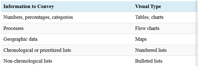
Placement: introduce in text, title, caption, source, labels/keys.
Avoid visuals alone; ideally <1/3 page.
Callouts & captions: short description under graphic; label elements; number sequentially.
Tables of Contents
TOC: shows topics, subtopics, pages; design with levels, indentation, spacing, capitalization.
Lists of Figures/Tables:
Figures = illustrations/photos/graphs; Tables = rows/columns.
2 visuals → separate lists; can combine under “List of Figures & Tables.”
Figures and Tables
Purpose:
Helps readers quickly locate illustrations, diagrams, tables, and charts.
Works like a mini-TOC but only for visuals.
Key points:
Figures = illustrations, drawings, photos, graphs, charts.
Tables = rows and columns of words/numbers (not figures).
If >2 visuals, create a separate list of figures.
For long reports with many visuals:
Make separate lists for figures and tables.
Can combine lists on the same page under “List of Figures and Tables”.
Clearly label items as a figure or table.
Headings
Purpose: guide readers, break text, help navigation, and organize writing.
Tips:
Be specific & reflect scope.
No stacked headings, pronouns, or articles at the start.
Avoid widowed headings.
Plan headings before rough draft.
Use software heading styles.
The CRAP Test
Contrast (C): draw attention via size, font, direction, alignment, graphics, color, white space.
Repetition (R): repeat design strategies → continuity (fonts, bullets, colors, templates).
Alignment (A): deliberate arrangement; use a grid/pattern; white space helps.
Proximity (P): group related items → shows relationships; affects text, graphics, spacing.
Cross-Cultural Audience Considerations
Audience matters → content + appearance.
Colors & visuals vary across cultures; red may mean danger or luck.
Cultural awareness:
Explicit = observable behavior.
Tacit = unstated norms/values.
Cultural Iceberg: tip = visible behavior; below surface = beliefs/values → affects communication.