User Interface Design
1. Visual Hierarchy
Visual hierarchy allows you to draw the user's attention to the most important elements. Here are some techniques to establish hierarchy:
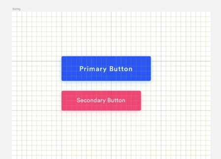
📘 Colors: Use bright and contrasting colors to highlight priority elements. Muted colors are perceived as less important.
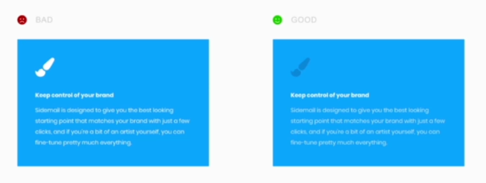
🔍 Size: Larger elements naturally draw the eye first.
🔷 Shape: Angular shapes like squares or rectangles stand out more than rounded shapes.

By applying these rules, you can guide the user's visual flow.
2. Layout
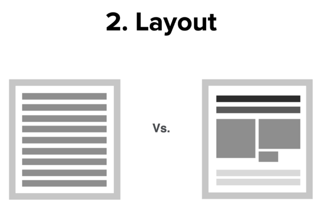
📂 A well-designed layout makes content more appealing and digestible:
➕ Organize content into distinct blocks interspersed with images/spaces.
⬜➖ Vary element sizes and shapes to create a dynamic design.
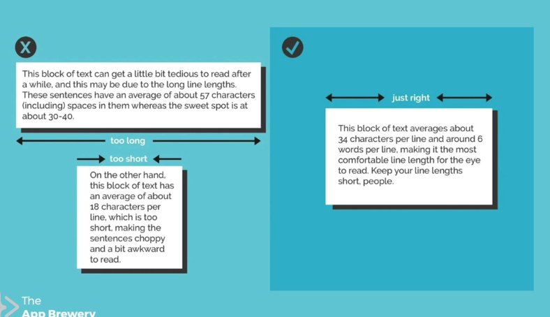
🌐 On the web, avoid overly long text blocks (ideal line length: 40-60 characters).
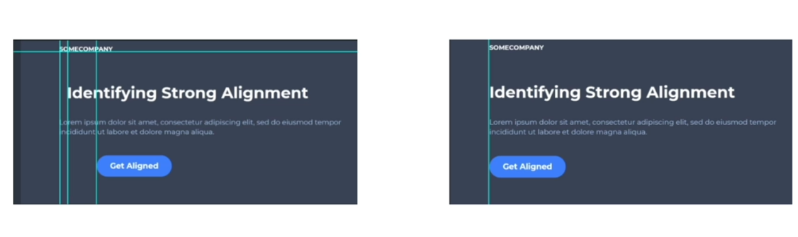
3. Alignment
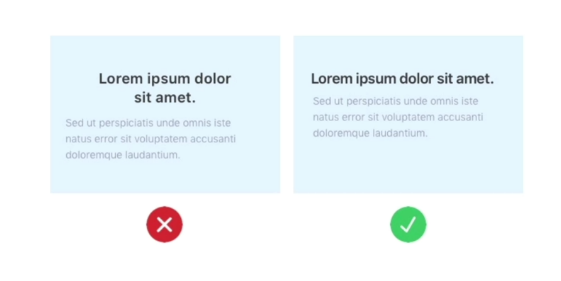
⚓ Careful alignment improves visual coherence:
➖ Reduce the number of different alignment points.
📏 Align elements along invisible guideline rows.
↖ Left or top alignment generally looks neater.
4. White Space
🏞 White space is a powerful tool to enhance your content:
➕ Increase spacing for an airy, high-end look.
➖ Lack of space creates a cluttered, low-cost impression.
👆 On the web, add white space around key elements (important buttons, etc.)
5. Target Audience

Adapt your design to your target audience:
✨ Consider the tone, style, colors that will appeal to them.
👶 A younger audience will appreciate a fun, bold style.
👔 A business audience will prefer a clean, minimalist design.
🔀 Be flexible in your design approaches to satisfy each audience type.