AP Human Geography - Map Projections and Types of Maps
Map Projections and Types of Maps
Introduction to AP Human Geography
The world is interconnected with large urban areas, shifting populations, and diverse cultures.
Globalization and climate change are continuously transforming economies and societies.
AP Human Geography studies these global patterns and their impacts.
Map Projections
Globes are not practical for everyday use due to their limitations in direction, country visibility, and internal boundaries.
Map projections are used instead, but all maps have distortion.
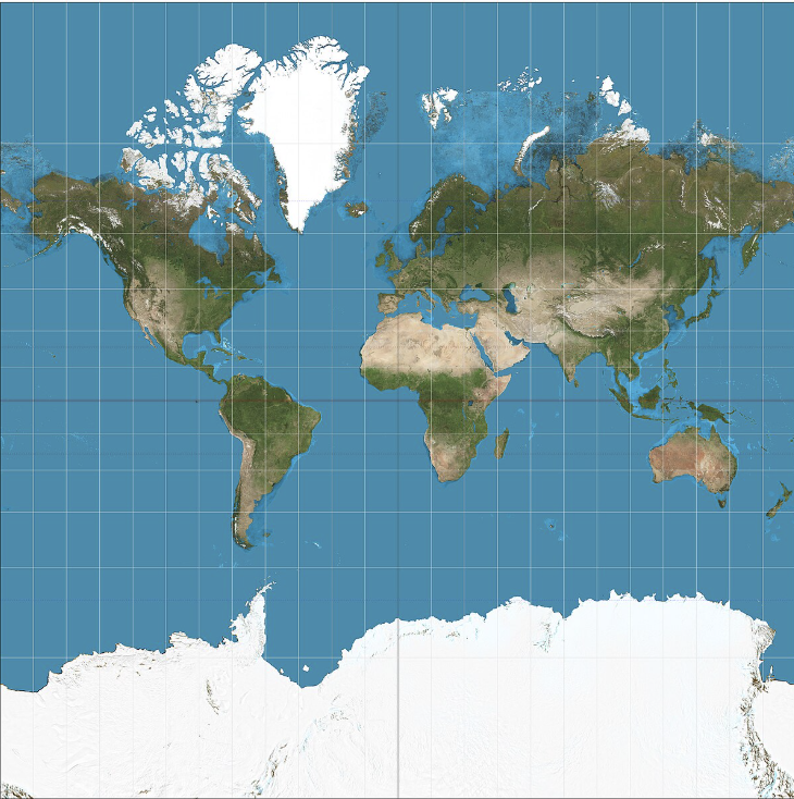
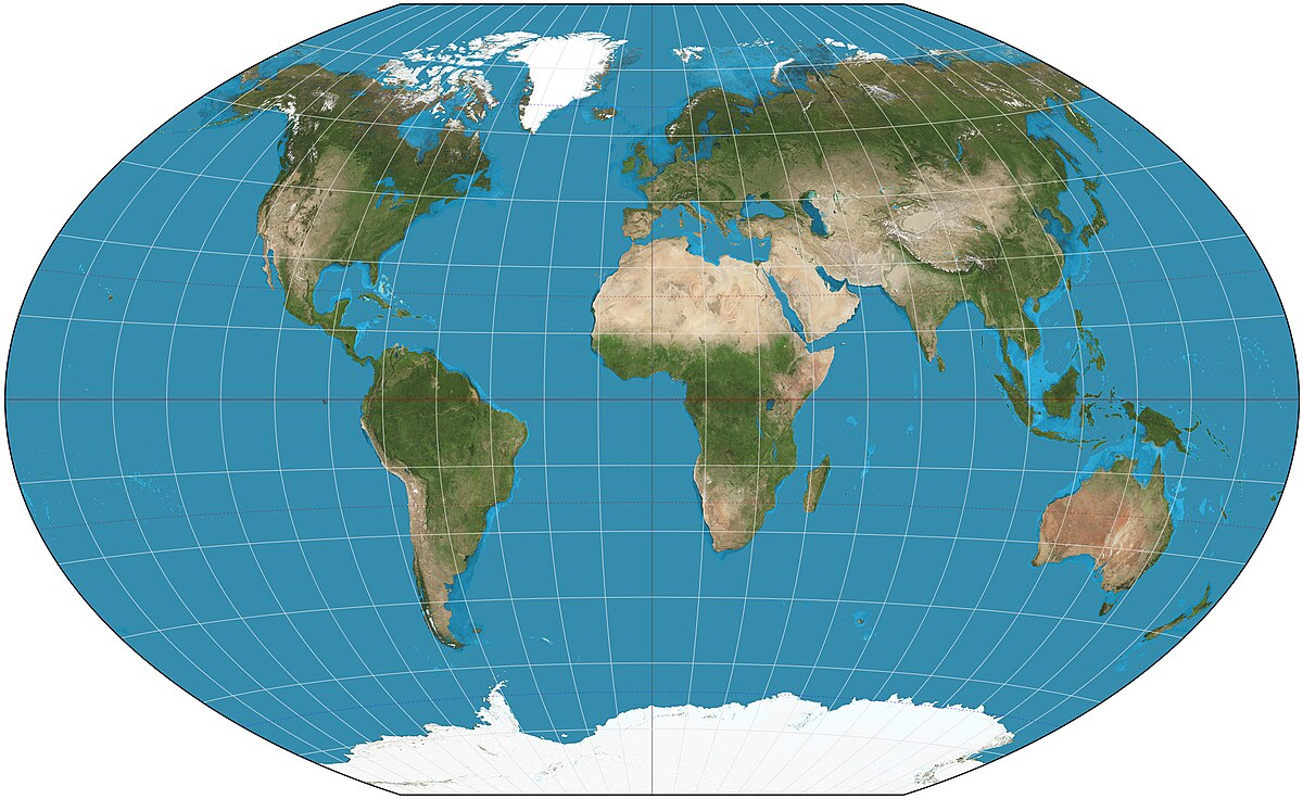
Mercator Map Projection
Commonly seen map projection, known for right angles and focus on longitude and latitude.
Good for displaying accurate direction, which is why it was used for naval expeditions.
Significant distortion in size and area of landmasses (e.g., Africa appears smaller than Greenland, which is incorrect).
Africa is large enough to contain the United States, Italy, Germany, France, The Netherlands, Belgium, Spain, Portugal, almost all of Eastern Europe, India, China, Japan, and The United Kingdom.
Circles retain their shape but vary in size on the Mercator projection.
Every map has distortion, impacting either direction, shape, area, or distance.
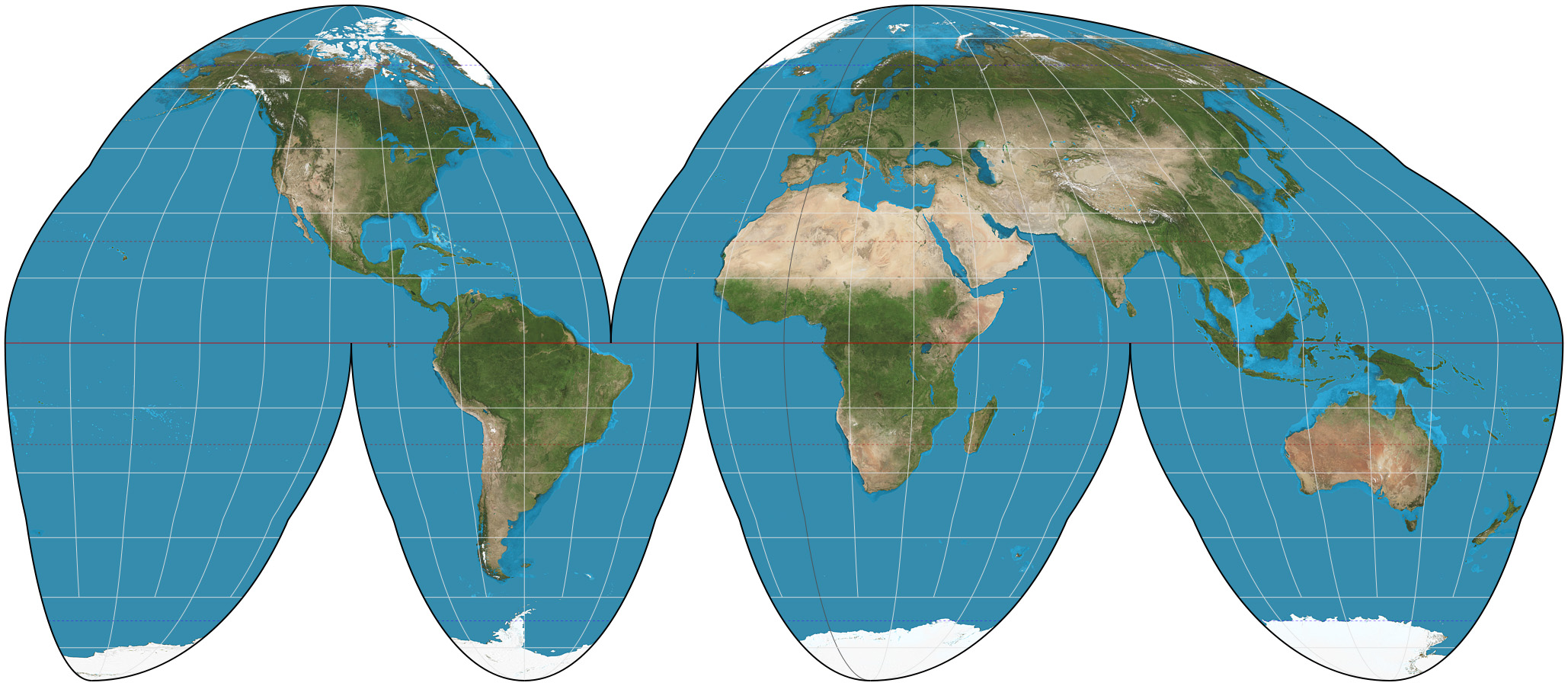
Good Homolosine Projection (Interrupted Map)
Equal area projection.
Shows true size and shape of landmasses.
Distortion in distance and near edges.
Not helpful for direction due to being interrupted.
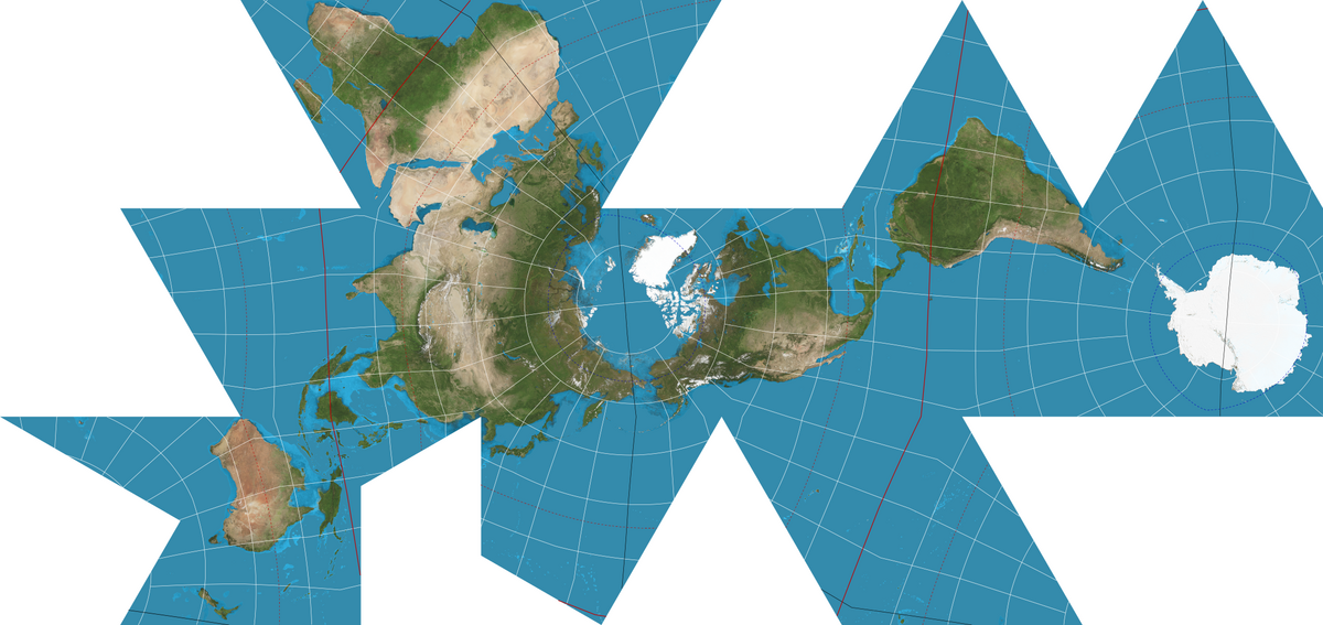
Fuller Map Projection (Interrupted Map)
Shows landmasses without interruption and maintains accurate size and shape.
Does not use cardinal directions, making it difficult to read.
Struggles with distortion, especially away from the center.
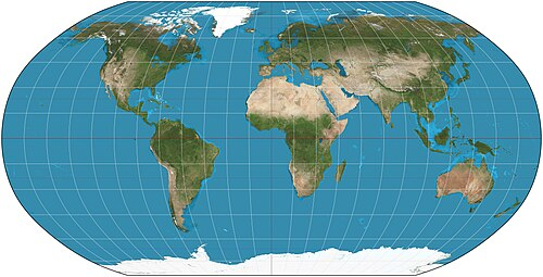
Robinson Projection
Distortion mainly at the poles.
Maintains true size and shape of landmasses.
Winkel Tripel Projection
Similar to the Robinson projection, rounder and larger.
Spreads distortion throughout the map, concentrating it at the poles.
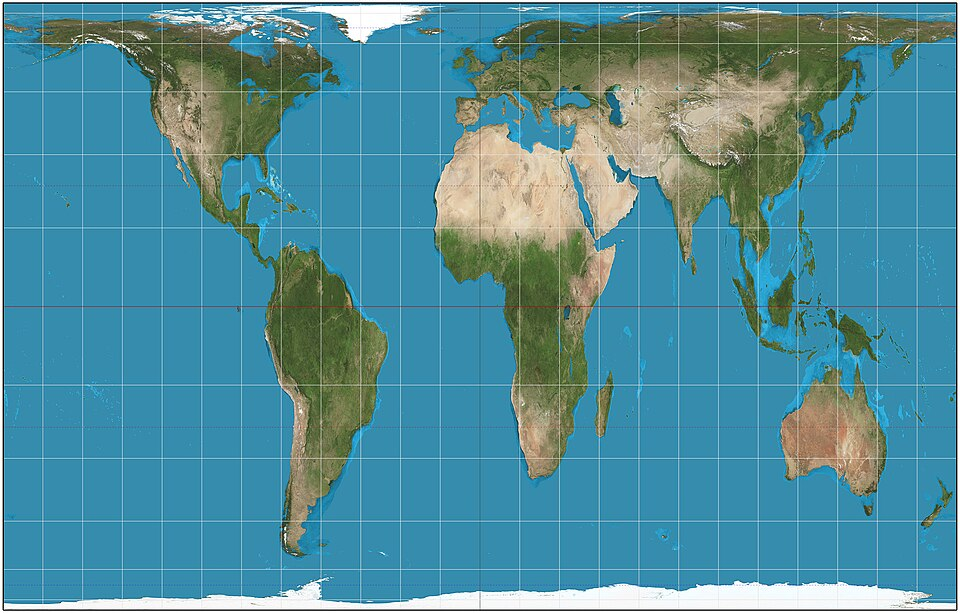
Gall-Peters Projection
Accurate in showing true size of landmasses.
Significant distortion in shape of landmasses and direction.
Often compared to the Mercator map to highlight differences in size, location, and shape.
Summary of Map Projections
Different map projections serve different purposes and are affected by distortion in various ways.
There are hundreds of map projections.
Types of Maps
Maps are generally categorized into reference maps and thematic maps.
Reference Maps
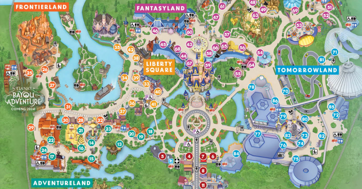
Informational maps used to find boundaries, geographic features, or directions.
Examples include maps at Disney World, topographic maps for hiking, and maps for finding locations like Chipotle, or just understanding local public transport.
Absolute vs. Relative Direction, Distance, and Location
Absolute Direction: Exact direction (e.g., 90 degrees east).
Relative Direction: Direction based on the surrounding area (e.g., "north of you").
Absolute Distance: Exact distance (e.g., 2.5 miles).
Relative Distance: Approximate measurement in time or direction (e.g., "six minutes away").
Absolute Location: Exact spot using coordinates (longitude and latitude), GPS coordinates.
Relative Location: Location described using surrounding geographic features (e.g., "near the water tower and fire station").
Thematic Maps
Display spatial patterns using quantitative data to present specific topics.
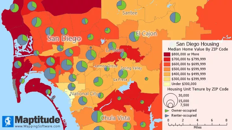
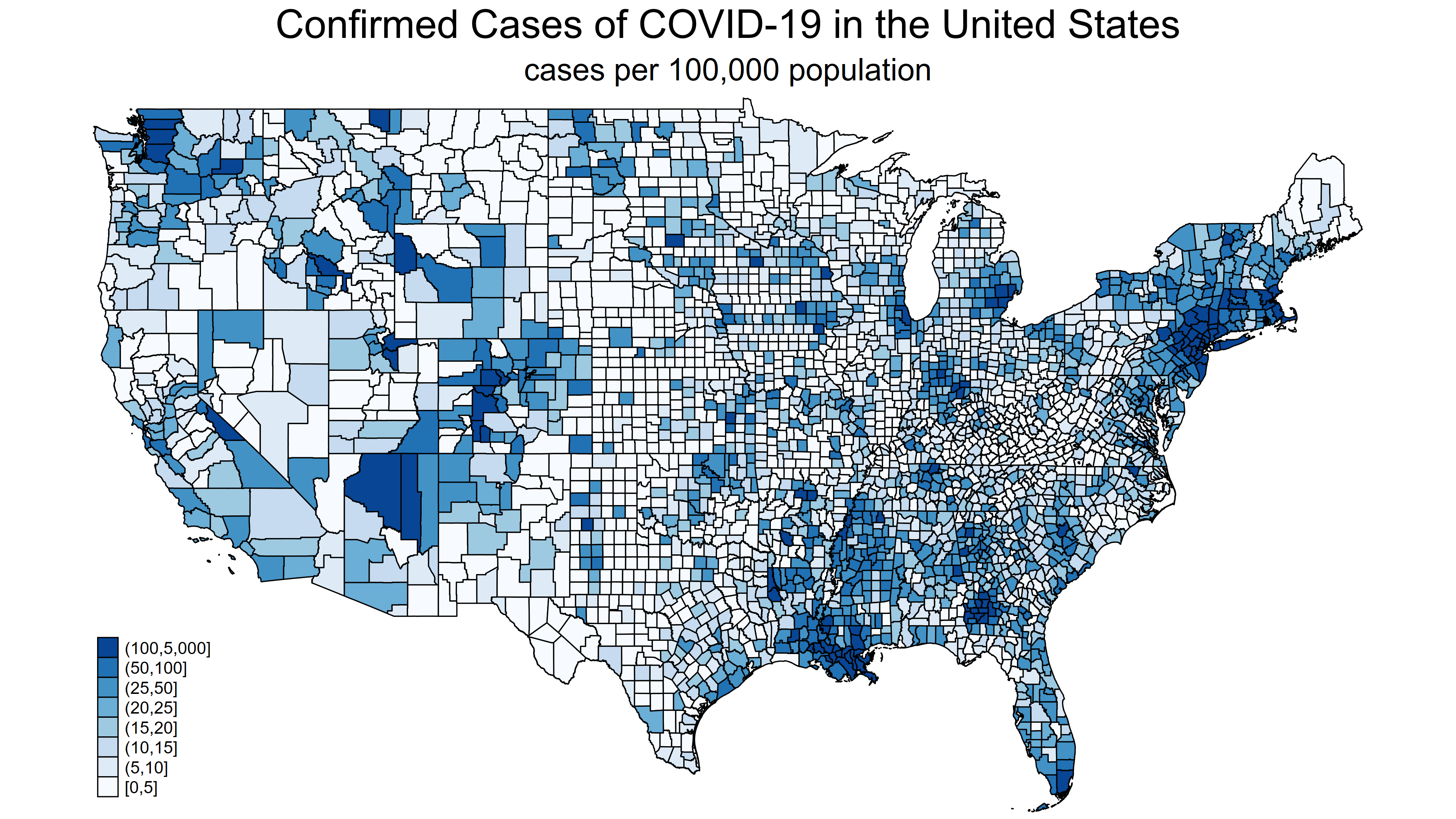
Chloropleth Maps
Use different colors to display data.
Great for showing quantity and density but use generalizations.
Example: Average life expectancy by country.
Issue: Generalizations can mask variations within regions (e.g., life expectancy variations within the states of the USA).
Small scale maps use more generality due to showing more of the Earth's surface, while large scale maps can use specific data due to showing less of the Earth's surface.
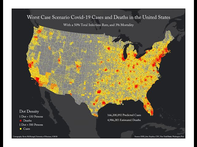
Dot Density Maps
Show data with points at the place the data is occurring; for example, racial dot maps.
Allows visualization of spatial distribution.
Can be confusing in areas with high data clustering where dots merge together.
If data is close together, it is considered density.
If data is spread appart it is considered dispersed.
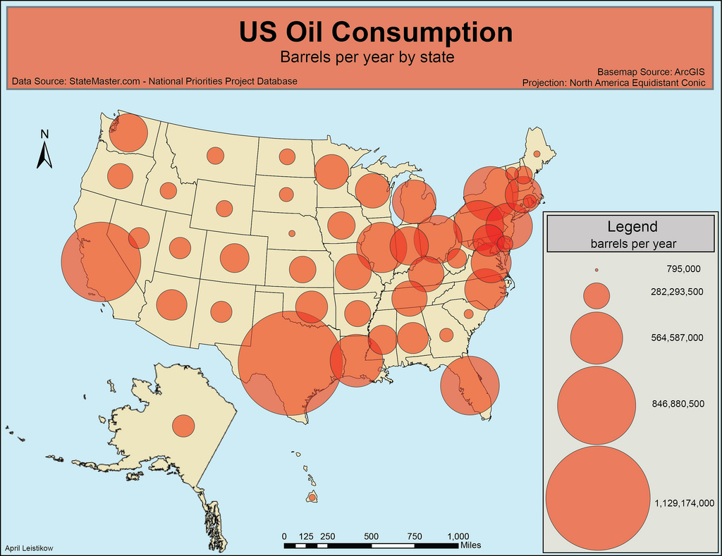
Graduated Symbol Maps
Use shapes, items, or symbols to show the location and amount of data.
Visually appealing but can be confusing due to overlapping information.
For example, it can show the voting breakdown by state and the number of voters.
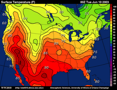
Isoline Maps
Use lines to connect areas with similar or equal amounts of information.
Commonly used as weather maps.
Can be difficult to read.
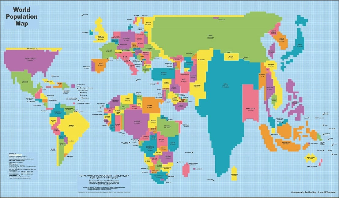
Cartogram Maps
Show data dynamically, with the largest area representing the greatest value.
Very visual but can be confusing due to distortion of shape and size.
An example is a map showing organic agriculture, where the size of the country reflects how much agriculture is being practiced.
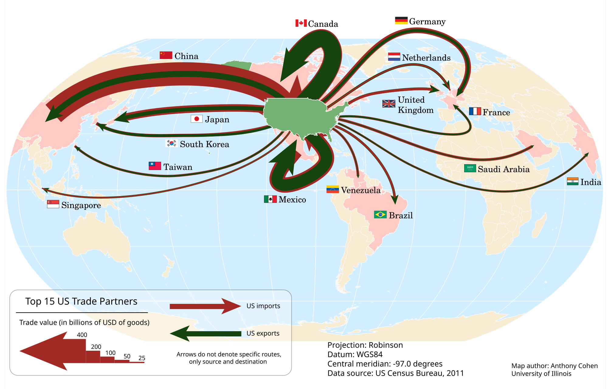
Flow Line Maps
Show the movement of goods, people, animals, or ideas between places.
The amount of movement is indicated by the size of the arrow; direction is color-coded for exports and imports.
An example is the top 15 United States trade partners from 2011.
Review and Resources
Review questions are available to test understanding.
The Ultimate Review Packet offers resources for all units of AP Human Geography.