Frequency Distributions
frequency distribution tables help organize variable values so you can:
see patterns
detect outlier values
compress data into a grouped frequency table
combine nearby items into score “bins” that represent a range of values
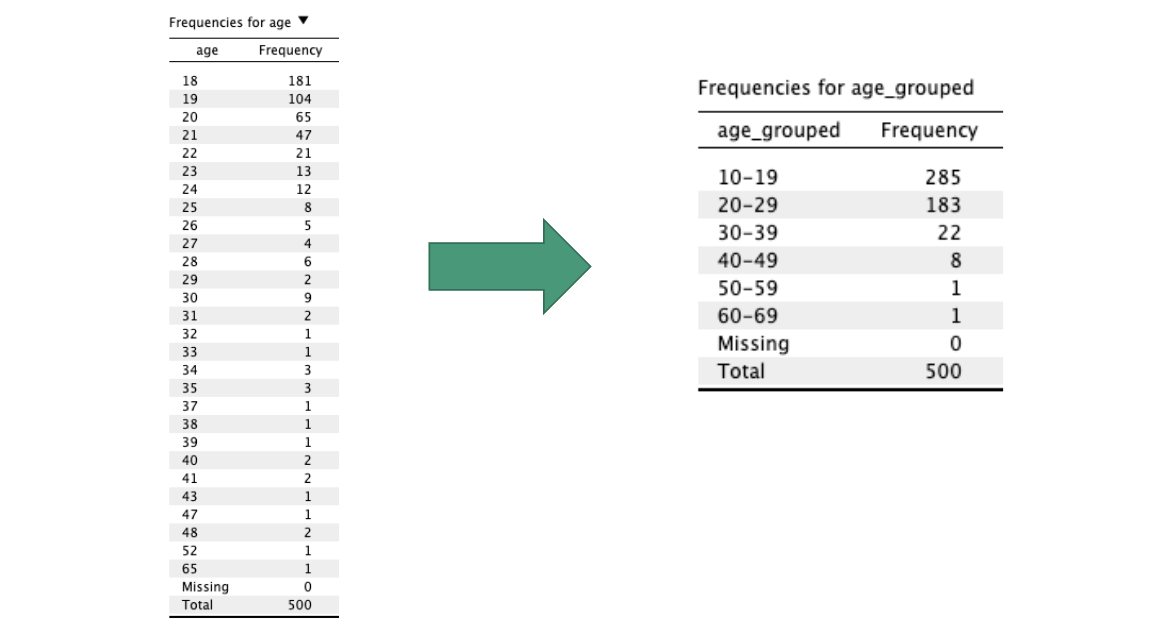
bins are exclusive, equal-sized, and exhaustive
exclusive: each item fits in no more than one bin
equal-sized: each bin has the same range
exhaustive: every item fits in a bin
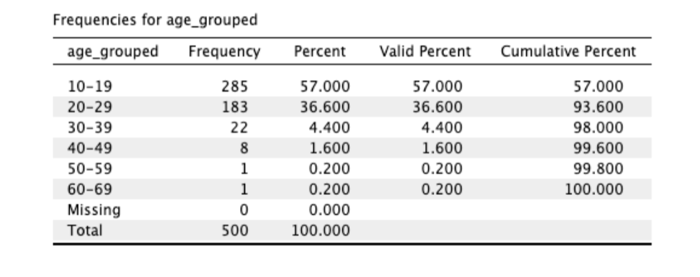
raw frequency tables reflect sample size
this can be useful is you want to see sample sizes
but this can make it hard to compare across studies with different sample sizes
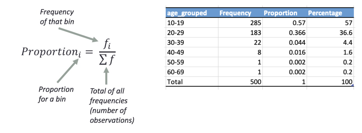
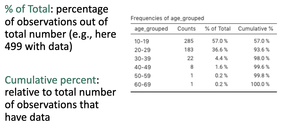
relative frequency tables express frequency in proportions or percentages
proportion is frequency over total measurements
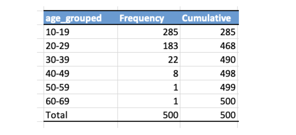
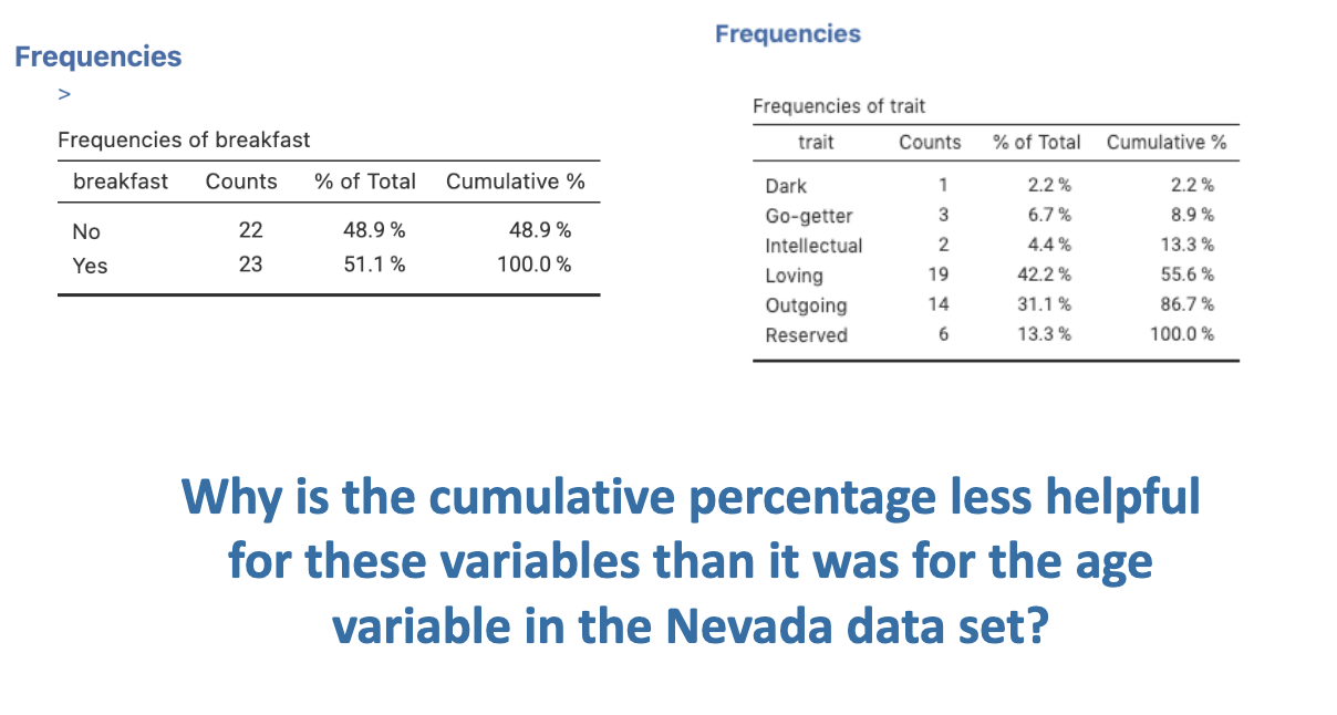
cumulative frequency counts accumulated scores across bins
useful for counting scores below or above a threshold value
cumulative frequencies can slo be counted in relative proportion or percentages
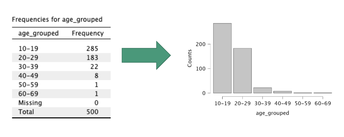
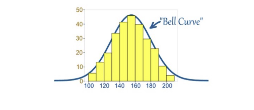
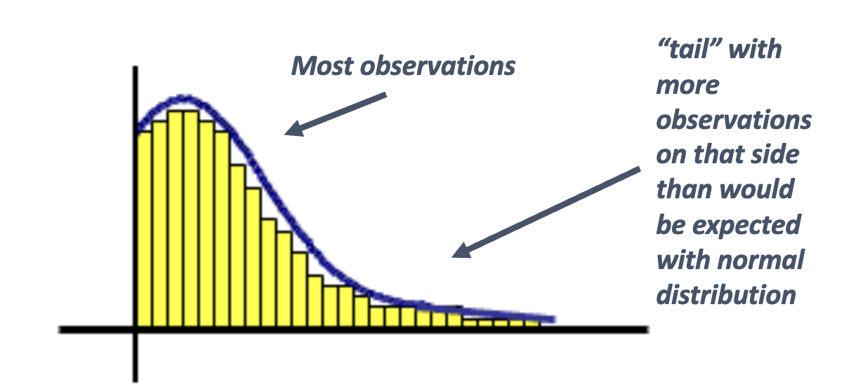
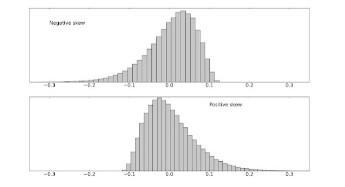
a histogram is a graphical depiction of a frequency table by plotting how often different values occur
expectations:
x-axis has possible values (bins from frequency table)
typically need to reflect bins of values for quantitative variables
bins should be equal-sized, exclusive and without gaps, and exhaustive of all possible scores
y-axis reflects frequency (raw count or relative using proportion or percentage)
increment of values on the y-axis should be equal-sized
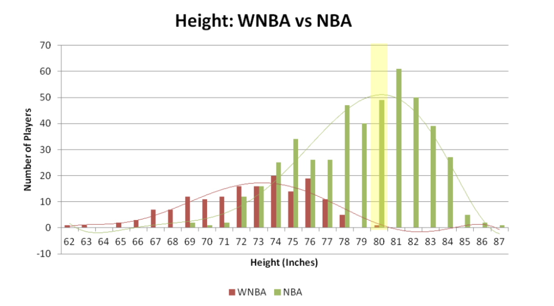
using histograms to describe the shape of a variable’s distribution
there are common distribution shapes that occur in nature
normal distribution: a symmetrical distribution of data with a single peak and a bell shape
skewed distribution: many observations clumped on one end, with a “tail” of extreme values on the other (skewed) end
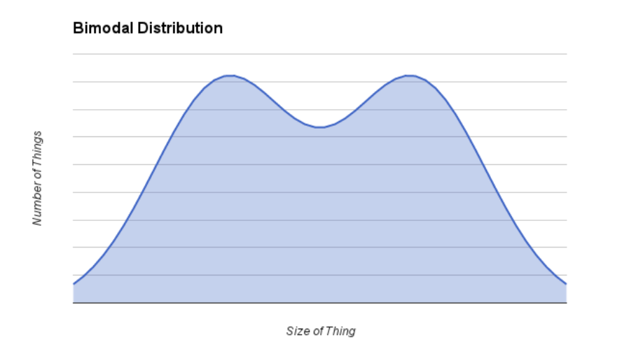
bi-modal: two peaks