topic 1
Population and Sample
Population: all subjects or items of interest; size N
Sample: a subset drawn from a population; size n
There are many possible samples from a population; number of samples depends on N and n
Terminology
Data: observations collected (e.g., measurements, responses)
Parameter: characteristic of a population
Statistic: characteristic of a sample (sample statistic)
The observed value of a statistic estimates a parameter
A statistic is unbiased if its sampling distribution mean equals the parameter
Individuals and Variables
Individuals: objects described in data (people, animals, plants, things)
Variable: property that characterizes an individual; can take different values
Types of Variables
Quantitative: numeric values; can report a mean across individuals (e.g., age, blood pressure, leaf length)
Categorical: descriptive categories; can report counts or proportions (e.g., gender, blood type, flower color)
Classifying Variables (Brief Example)
Example dataset (from slides): Diagnosis (categorical), Age at death (quantitative)
Question: What is recorded about each individual? Is each variable quantitative or categorical?
Their diagnosis and age at death are being recorded, with the diagnosis being categorial variables and the age at death being the quantitative variables
Visualizing Quantitative Data: Common Graphs
Histograms: single-variable overview; show pattern of variability; useful for large data sets
Dotplots (or Stem & Leaf): show raw data; useful for small data sets as they describe the pattern of variability
Time Series Plots: data points in sequence (e.g., over time); emphasizes changes over time
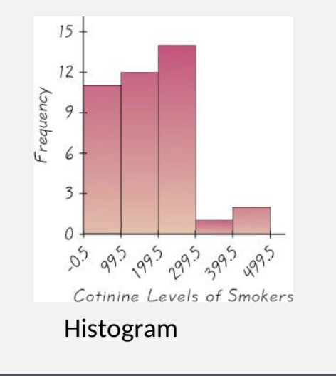
Histograms
Histogram: horizontal axis = class intervals (bins); vertical axis = frequencies (counts)
Heights of bars = frequencies; bars are adjacent
Relative Frequency Histogram: vertical axis = relative frequencies (percentage)
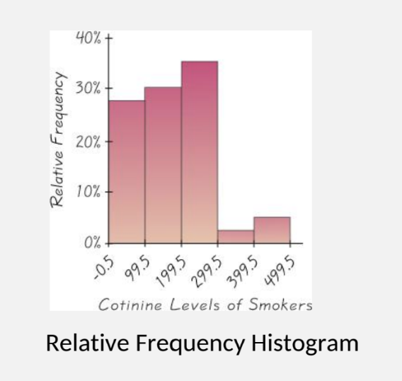
Making a Histogram
Divide range of the quantitative variable into equal-size intervals (bins)
Vertical axis = either frequency or relative frequency
For each class, draw a column with height = count or percent in that class
Dotplots
Dotplot: plot each data value on a scale; dots stack for identical values
Stem-and-Leaf Plot
Stem-and-Leaf: data are split into stem (leading digits) and leaf (trailing digits)
Measures of Center
Center = representative value indicating where the data cluster
Main measures: Mean, Median, Mode
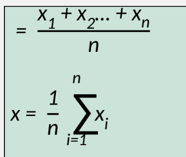
The Mean
Definition: mean = arithmetic average
Formula: adding values and dividing by total number of values
Key:
(mu) = Pop. Mean
N= # of indv. in a pop.
x = sample mean
n = sample size
The Median
Definition: middle value when data are ordered
How to find: sort values; if n is odd, median = middle value; if n is even, median = mean of two middle values divided by 2
The Mode
Definition: most frequent value
If two values share greatest frequency: bimodal
More than two with greatest frequency: multimodal
If no value repeats: no mode
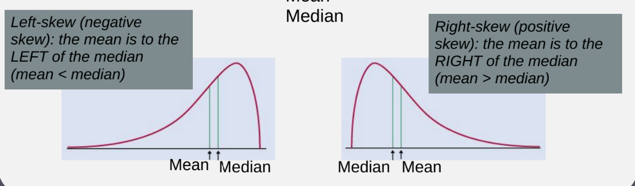
The Best Measure of Center
Mean is not resistant to skews and outliers
Median is resistant to skew and outliers
For approximately symmetric data with one mode, mean ≈ median
For obviously asymmetric data, report both mean and median
Measures of Variation
Variation measures how data values differ from each other
Key concepts: range, standard deviation, variance, quartiles
Range and Standard Deviation
Range = max − min
Standard deviation (sample): s=
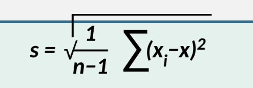
Notation: \sigma = population SD; s = sample SD
Variance
Variance (sample) =
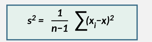
Variance = square of SD
Notation
\sigma = Population standard deviation (sigma)
x^2 = Population variance
s = Sample standard deviation
s2 = Sample variance
N = Population size
n = Sample Size
Quartiles and Five-Number Summary
Median is Q2 (second quartile), 50th percentile
Quartiles divide the data values into 4 equal parts
Q1 = 25th percentile; Q3 = 75th percentile
Different procedures can yield different quartiles; not universal
Five-number summary: min, Q1, Median (Q2), Q3, max
Boxplots and IQR
IQR = Q3 − Q1
Boxplot shows min, Q1, median, Q3, max; whiskers extend to data range within 1.5 IQR
Outliers are values outside typical pattern (suspected outliers) beyond 1.5 IQR from quartiles
IQR and Suspected Outliers
Suspected low outlier: value < Q1 − 1.5 × IQR
Suspected high outlier: value > Q3 + 1.5 × IQR
How to Draw a Boxplot
Steps: compute five-number summary; set scale to include min and max; draw box from Q1 to Q3 with median line; extend whiskers to min and max
Standardization: Z-scores
Standardized score (z-score) allows comparison across data sets
It’s the number of sd that a given value x is above or below the mean
Population: z = \frac{x - \mu}{\sigma}
Sample: z = \frac{x - \bar{x}}{s}
Interpreting Histograms (4 characteristics)
Shape/Distribution: unimodal, bimodal, symmetric, skewed, irregular
Center: approximate midpoint or peak location
Spread: range of observed values
Outliers: any points that may be outliers
Exploratory Data Analysis (EDA)
EDA uses tools to understand center, variation, distribution, outliers, and time
Outliers can dramatically affect the mean, SD, and histogram scale
Boxplot Utility (IQR approach)
Boxplot highlights central tendency and variability; useful for comparing groups
Quick Reference: Example Use of IQR for Outliers
Compute IQR; identify values beyond Q1 − 1.5 IQR or Q3 + 1.5 IQR as possible outliers