Art theory design test
VISUAL IMPACT
Visual impact has been created through limited use of colour and imagery. The high contrast, especially the black and white on the bright orange background. This draws immediate attention from passers by and they will stop and find out about the movie.
Visual impact is created through the use of simplified imagery. The simple silhouettes of the figures stand out against the bright orange oval in the centre and the hypotrochoid curves surrounding them making them look like they are spinning, this relates to the movie title and storyline.
STYLE
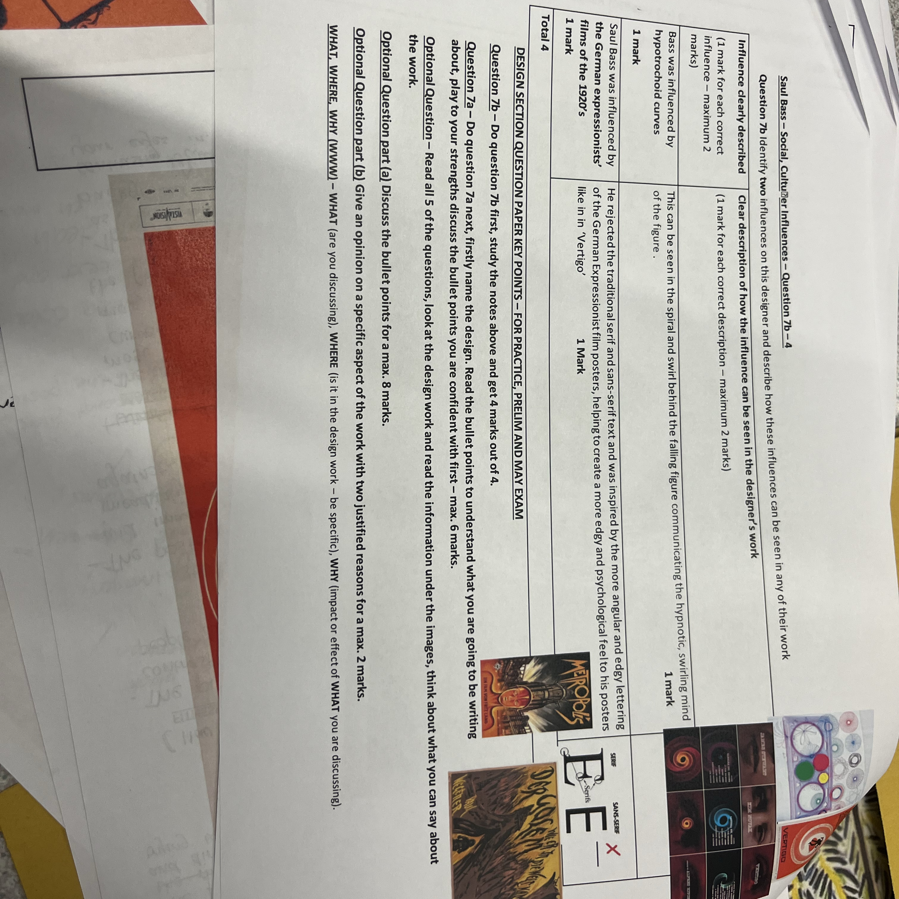
The angular style of the lettering is influenced by German Expressionist horror films of the 1920s, Bass wanted to create an edgy and awkward feel to the poster which reflected the psychologically complex storyline, this placed Vertigo outside the Hollywood mainstream at the time.
The poster has a minimalist style due to the flat use of three colours and simple shapes and silhouettes with no tone. All the text and imagery has a specific purpose and it has a very clean and clinical feel against the bright orange/red which makes it striking from a distance.
FUNCTION
The function of this posteris to advertise the movie Vertigo. It does this well as the test is large scale and in black, which stands out against the orange/red background.
The function of this posteris to advertise the movie Vertigo. The poster seemsto promote the famous actors and director to sell the movie as they are at the top of the poster while the film title is at the bottom making it appear secondary and less important.
FITNESS FOR PURPOSE
The poster is fit for purpose as the lettering is black and stands out against the orange/red background which makes it easier to read and grabs attention.
The poster is fit for purpose as the word 'masterpiece' and the famous names of the actor, actress and director are highlighted by placing them at the top of the poster. This will help to convince people to go and see the movie if it is their favourite actor, actress or director.
The poster is fit for purpose as there is limited use of colour and imagery. The high contrast of black and white on orange immediately grabs attention as does the simplicity of the figures on the spiral which intrigues the viewer as to the storyline.
MATERIALS AND/OR TECHNIQUES
The technique of using hypotrochoid curves in the centre of the poster give the illusion of dizziness and that the figures are falling. This links the imagery to the title of the movie 'Vertigo', which is the feeling of spinning or moving and linked to the idea of falling from a height.
The technique of using hand drawn and angular lettering was different to most film posters at the time that used traditional curved serifs. Bass drew inspiration from German Expressionist horror films of the 1920s, he wanted to create an edgy and awkward feel to the poster which reflected the psychologically complex storyline.
The two-colour print process of orange and black on white has immediate impact as the flat blocks of colour create a high contrast. The orange background is bright and eye-catching while the black lettering stands out and the white spiral draws the eye into the image of the two figures. This combination of colour will draw viewers to the poster.
TARGET MARKET/AUDIENCE
The target market for this poster are people who have enjoyed orare fans of films directed by Alfred Hitchcock as his name is bold and clear at the top of the poster.
The target market for this poster are people who are fans of the famous actors in the film, Kim Novak and James Stewart, as their names are large and at the top of the poster for impact.
The target market for this poster are people who enjoyed movies outside the Hollywood mainstream at the time. This is due to the use of angular lettering which was different to most film posters at the time that used traditional curved serifs. Bass wanted to create an edgy and awkward feel to the poster which reflected the psychologically complex storyline.