Business Statistics: Chapter 4; Describing Data (Displaying & Exploring Data)
Dot Plot
Dot Plot: Groups data as little as possible, not losing identity of individual observations. Shows shape of distribution, value data tends to cluster around, and the largest and smallest observations. Better for smaller data sets, while histograms are better for larger ones.

Measures of Position
Measures of Position: divides a set of observations into equal parts to determine the location of values.
Quartiles: values of an ordered (minimum to maximum) data set that divide the data into four intervals: Q1, Q2, Q3, Q4.
Use Excel function to find quartile: =Quartile
Deciles: values of an ordered (minimum to maximum) data set that divide the data into 10 equal parts: 1st decile, 2nd decile, 3rd decile. . . 10th decile.
Is found the same way as a percentile is. . .
Percentiles: values of an ordered (minimum to maximum) data set that divide the data into 100 intervals: 10th percentile, 20th percentile, 30th percentile. . . 100th percentile.
Location of Percentile= (n+1) x P/100
n= number of observations
P= percentile to find location of
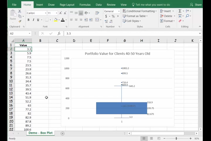
Box Plots
Box Plots: shows general shape of a variable’s distribution. Based on five descriptive statistics: maximum and minimum values, first and third quartiles, and the median.
A box hovering above number line. Middle line is median. Ends of box are Q1 and Q3. Lines outside of box show min/max values.
Interquartile Range: range of values between Q1 and Q3, 50% of values are located here. Found by Q3-Q1.
Outliers: Data point very far from the others. Observation is an outlier if it is 1.5 times the interquartile range above Q3 or below Q1.
Upper Outlier Boundary: Q3+ 1.5(Q3 - Q1)
Lower Outlier Boundary: Q1- 1.5(Q3 - Q1)
Skewness
Four Common Shapes of Skewness:
1.) Symmetrical: mean and median are equal, and data values are evenly spread around them.
2.) Positively Skewed: Peak is skewed to the right. Mean is larger than the median.
3.) Negatively Skewed: Peak is skewed to the left. Mean is smaller than the median.
4.) Bimodal: Has two or more peaks, often having two or more populations involved.

Coefficient of Skewness:
Pearson’s: based on difference between the mean and the median.
Skewness Coefficient: 3(Mean - Medial) / standard deviation
Software’s: based on the cubed deviations from the mean.
Use =SKEW function in excel
Correlation Coefficient
Scatter Diagram: show relationship between two variables measured at interval or ratio level. One variable on X-axis, the other on the y-axis.
Correlation Coefficient: a statistic to measure the direction or strength of a relationship between two variables.
Ranges from -1 to +1
if range is -1, the relationship between the two variables is perfectly negative
if range is +1, the relationship between the two variables is perfectly positive
If range is close to o, there is no relationship
Use =CORREL Function in excel to find.
Contingency Tables
Contingency Table: to study relationship between two variables that are nominal or ordinal level. Classifies sample observations using two characteristics.
Excel Functions
Compute Quartiles, Percentiles, and Deciles in Excel:
Sort data from minimum to maximum values
Use =QUARTILE.EXC for 1st, 2nd, 3rd quartiles for a data set.
Should look like: =QUARTILE.EXC(data set, number of quartile)
Will not find the minimum/maximum values, but .INC will. Only use .EXC on homework unless told otherwise.
Use =PERCENTILE.EXC to find percentiles.
Should look like (for 75th percentile): =PERCENTILE.EXC(data set, 75%)
This can be used to find deciles, also.
Box & Whisker Chart: for Box Plot.
Select data set
Use PivotChart for Box & Whisker Chart