01.03 Production Possibilities Curve
Why Economists Use Models
Economics deals with complex human behavior, scarce resources, and choices that involve trade-offs.
Because it’s impossible to track every variable in the real world, economists use models:
Simplified representations of reality
Designed to highlight essential relationships
Allow predictions about how people respond to incentives
Key idea: Models intentionally ignore non-essential details. Their power comes from simplification, not realism.
The Circular Flow Model (Review)
Shows how goods, services, and money move through the economy.
Consists of:
Households (consumers)
Firms (producers)
Product market
Factor/resource market
Although you will not need to recreate it on the AP exam, it’s important because it introduces:
Flows of resources (land, labor, capital, entrepreneurship)
Flows of goods/services
Flows of monetary payments
Introducing Your First Testable Micro Model: The Production Possibilities Curve (PPC)
Even though the prompt mentions that AP students are not asked to reproduce the circular flow model, they are expected to understand and explain the Production Possibilities Curve, which is the first major graph you’ll use throughout microeconomics.
What the PPC Represents
A PPC shows:
The maximum combinations of two goods/services an economy can produce
Given:
Fixed resources
Fixed technology
Full employment
Efficient use of resources
It is one of the earliest and most important microeconomic models because it illustrates scarcity, choice, opportunity cost, and efficiency.
The Law of Increasing Opportunity Cost: To produce more units of one good, you will give up more and more of the other good.
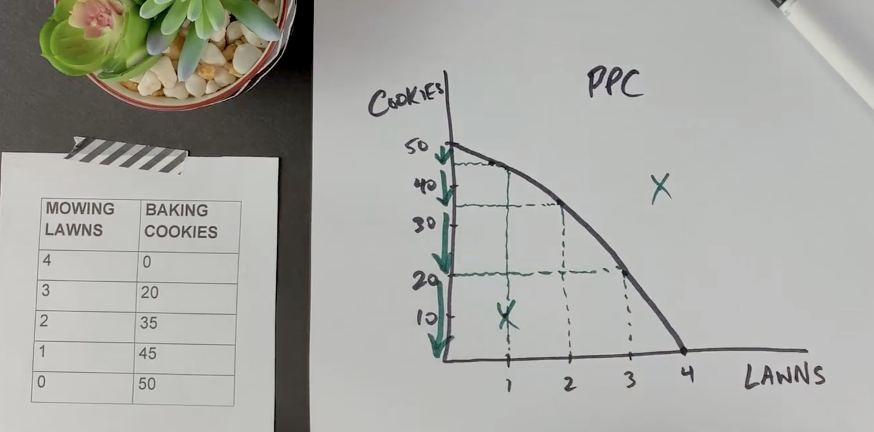
Production Possibilities Frontier (PPF)
What the graph shows
A curve showing all the possible combinations of mowing lawns and baking cookies you can produce in one day.
The curve is downward-sloping, showing trade-offs.
It is bowed outward, showing increasing opportunity cost.
How to interpret it
Each point on the PPF represents a productive combination, such as:
(4 lawns, 0 cookies)
(3 lawns, 20 cookies)
(2 lawns, 35 cookies), etc.
As you move down the curve:
You mow fewer lawns
You bake more cookies
This reveals a trade-off: producing more of one good requires sacrificing production of the other.
Key idea illustrated
Scarcity and trade-offs — you cannot produce unlimited amounts of both goods because time is limited.
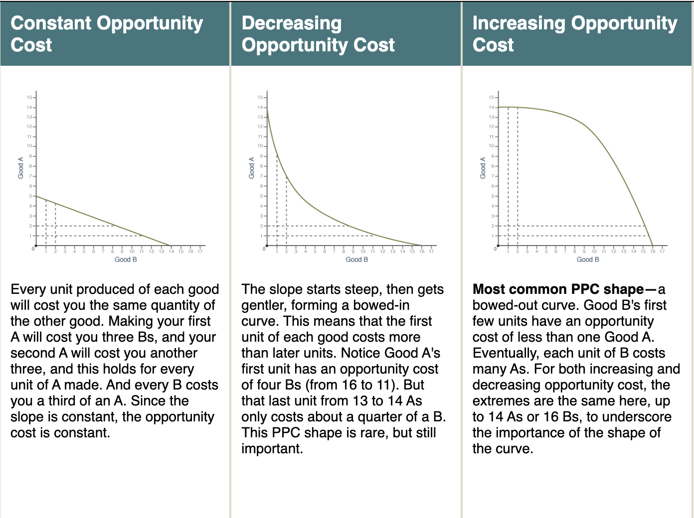
Bowed-Out PPC
Opportunity cost is increasing.
Resources are not equally efficient at producing both goods.
Most realistic shape.
Opportunity Cost Graph (Slope Interpretation)
What the graph shows
The slope between any two points on the PPF measures:
Opportunity cost = what you give up / what you gain
How to interpret it
Example:
Going from 4 → 3 lawns (you mow 1 fewer lawn), cookies rise from 0 → 20.
Opportunity cost of 1 lawn = 20 cookies
Later:
Going from 2 → 1 lawn, cookies go from 35 → 45.Opportunity cost of 1 lawn = 10 cookies
Key idea illustrated
The graph shows increasing marginal opportunity cost:
The more cookies you already make, the less efficient you are at making additional cookies.
The more lawns you mow, the more cookies you must sacrifice to mow one more lawn.
This is why the PPF is concave (bowed out).
3. Efficiency vs. Inefficiency Graph
What the graph shows
Points ON the curve: productively efficient
Points INSIDE the curve: inefficient (you’re wasting time/resources)
Points OUTSIDE the curve: unattainable with current resources
How to interpret it
If you produce (2 lawns, 35 cookies):
That point lies exactly on the PPF → efficient
If someone claims they can produce (3 lawns, 35 cookies):
That lies outside the PPF → not possible with one day of labor.
This graph helps AP students understand:
Resource use
Efficiency
Constraints
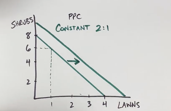
Straight-Line PPC
Opportunity cost is constant.
Resources are equally adaptable for both goods.
Key Concepts Illustrated by the PPC
1. Scarcity
The PPC shows a boundary of what is possible.
Everything beyond the curve is impossible with current resources.
2. Choice
Any point on the curve represents a choice about how to allocate resources between two goods.
3. Opportunity Cost
The slope of the PPC shows how much of one good must be sacrificed to produce more of another.
Opportunity cost = what you give up / what you gain
AP loves questions that ask you to identify the opportunity cost of moving from one point on the curve to another.
4. Efficiency and Inefficiency
Any point on the PPC = efficient
Any point inside the PPC = inefficient (resources underutilized)
Any point outside the PPC = unattainable with current resources
5. Economic Growth
Shown by an outward shift of the PPC due to:
More resources
Better technology
Improved productivity
Constant vs. Increasing Opportunity Costs
Constant Opportunity Cost
Straight-line PPC
Resources used to produce the goods are perfectly adaptable
Increasing Opportunity Cost
Bowed-out (concave) PPC
Resources are not perfectly adaptable
Most real-world PPCs are bowed out
This concept is frequently tested on FRQs.
Why This Model Matters in Microeconomics
The PPC is foundational because it helps explain:
How societies decide what to produce
The cost of those choices
The trade-offs individuals and firms must face
It also leads to more advanced topics such as:
Comparative advantage
Specialization and trade
Efficiency vs. equity