The Ultimate Guide to Typography
Introduction to Typography
Definition: Typography is a critical element of design that encompasses the arrangement and style of text.
History of Typography
Early Beginnings:
Early forms of printing using punches and dies (2nd century BC, Mesopotamia).
Influence from ancient civilizations such as Babylon and Greece.
Printing Press:
Johannes Gutenberg invented the movable type printing press.
Introduced the Blackletter typeface, making typography accessible.
Evolution:
15th-16th centuries saw the popularization of Roman typestyles for better readability over Blackletters.
Advances created refined serif fonts, with Humanist serifs like Caslon.
Transitional Typefaces:
John Baskerville created the first transitional typeface with heightened contrast.
Industrial Revolution:
Printing technology evolved, leading to varied typefaces for advertising.
Introduction of Futura and Humanist sans serifs like Gill Sans.
Digital Era:
Emergence of Helvetica as a standard functional typeface.
Growth of digital technologies allowed for extensive font creation.
Typeface vs. Font
Definitions:
Typeface: A family of related fonts sharing common design.
Font: A specific style, weight, and size within a typeface.
Historical Context:
Originated from metal casting for typesetting; now largely digital.
Type Classifications
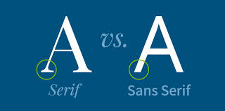
Serif Fonts
Definition: Fonts with small feet at the ends of their strokes.
Subgroups:
Old Style: Developed between the 15th-18th century, characterized by round serifs (e.g., Goudy Bookletter).
Transitional: Features sharper serifs and higher stroke contrast (e.g., Baskerville).
Modern: Straight, flat serifs with considerable contrast (e.g., Bodoni).
Slab Serif: Bold, heavy, and easier to identify (e.g., Arkibal Serif).
Sans Serif Fonts
Definition: Fonts without serifs, characterized by a clean, modern look.
Subgroups:
Grotesque: Slight contrast, open apertures (e.g., Bw Glenn Sans).
Neo-Grotesque: Stripped-down forms for neutrality (e.g., Physis).
Humanist: More calligraphic influences (e.g., Gill Sans Nova).
Geometric: Characterized by circular forms (e.g., Futura).
Script Fonts
Definition: Fonts mimicking cursive handwriting, divided into formal and casual styles.
Formal Scripts: Elegant and suitable for invitations.
Casual Scripts: Relaxed and friendly (e.g., Castinos).
Additional Categories
Calligraphic Fonts: Mimic brush strokes with contemporary forms (e.g., Billow).
Handwriting Fonts: Informal and lack structure (e.g., Summer).
Blackletter: Medieval style influenced by illuminated manuscripts.
Display/Decorative Fonts: Diverse and experimental, not suitable for body text.
Choosing the Right Typeface
Factors in selecting typeface: legibility, readability, and the audience.
Best Practices:
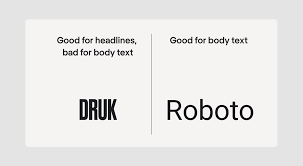
For long-form text: Use serif or sans serif fonts.
Use display fonts sparingly for emphasis.
Font Family Variations
Font Weight: Varies from light to heavy, creating hierarchy.
Font Style: Includes regular, italic, and oblique variations that enhance emphasis.
Proportion: Affects character width relative to height.
Common Typesetting Mistakes
Rags: Uneven margins fixed by hyphenation or manual breaks.
Rivers: Gaps in justified text addressed by unjustifying or hyphenating.
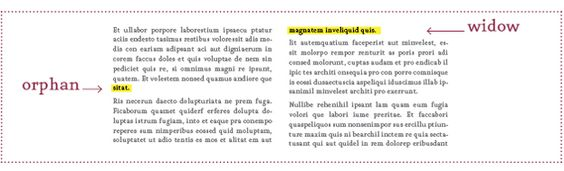
Orphans and Widows: Short lines at paragraph ends corrected through tracking or adjustments.
Choosing Fonts for Design
Font Personality Traits:
Serifs: Traditional and formal.
Sans Serifs: Clean and contemporary.
Slab Serifs: Bold and modern.
Scripts: Organic and personal touch.
Displays: Varied, for short texts only.
Font Selection Process: Consider brand guidelines and project requirements.
Conclusion
Typography plays a vital role in graphic design. Mastery of concepts helps in effective communication through visual elements.
Continuous evolution in typography is expected, opening up avenues for innovative design.
Major Type Groups in Typography
Serif Fonts: Fonts characterized by small feet at the ends of their strokes, including subgroups:
Old Style: Round serifs, e.g., Goudy Bookletter.
Transitional: Sharper serifs and higher contrast, e.g., Baskerville.
Modern: Straight, flat serifs, e.g., Bodoni.
Slab Serif: Bold and heavy, e.g., Arkibal Serif.
Sans Serif Fonts: Fonts without serifs, offering a clean, modern look. Subgroups include:
Grotesque: Slight contrast, open apertures, e.g., Bw Glenn Sans.
Neo-Grotesque: Neutral forms, e.g., Physis.
Humanist: Calligraphic influences, e.g., Gill Sans Nova.
Geometric: Circular forms, e.g., Futura.
Script Fonts: Mimic cursive handwriting, divided into:
Formal Scripts: Elegant, suited for invitations.
Casual Scripts: Relaxed, e.g., Castinos.
Calligraphic Fonts: Designs that mimic brush strokes with contemporary forms, e.g., Billow.
Handwriting Fonts: Informal styles lacking structure, e.g., Summer.
Blackletter: Medieval style fonts influenced by illuminated manuscripts.
Display/Decorative Fonts: Diverse, experimental designs not suitable for body text.
Fonts for Body Copy and DisplayBody Copy Fonts
Serif Fonts:
Times New Roman
Georgia
Garamond
Sans Serif Fonts:
Arial
Helvetica
Calibri
Display Fonts:
Serif Display Fonts:
Playfair Display
Didot
Sans Serif Display Fonts:
Bebas Neue
Futura
Avenir
Script/Decorative Fonts:
Pacifico
Great Vibes
Lobster
Choosing Fonts for Both:
Use a harmonious combination of a serif or sans serif body copy font with a matching or complementary display font to ensure aesthetic appeal and readability in designs.