Frequency Distributions/Table + Graphs (Week 2 Day 1)
Understanding Frequency and Data Distribution
Frequency is simply the count of how many times a particular value or category appears in a data set. Imagine you're counting how many students got a score of 80 on a test; that count is the frequency for the score 80.
A frequency distribution is a structured summary that shows you at a glance how often each unique value or category of a variable occurs across your entire data set.
1.1 Components of a Frequency Distribution Table
To organize raw data into a more understandable format, we use a frequency distribution table. This table typically has columns for:
Scores (X): This column lists all the individual data values, scores, or categories that appear in your dataset. For example, if you're looking at test scores from 0-100, each unique score observed would be an 'X' value.
Frequencies (F): This column shows the number of times each corresponding 'X' value occurred in your data. It's the 'count' for each score.
Key Notations You'll Encounter :
N: This represents the total number of observations or data points in your entire dataset. It's essentially your sample size or population size. For instance, if you surveyed 50 people, then N=50.
ΣF (Sigma F): The sum of all frequencies in your table. If you correctly count and add up all the 'F' values, this sum must equal 'N' (the total number of observations). It's a useful check to ensure your counts are accurate.
ΣFX (Sigma F X): This notation means 'the sum of each value (X) multiplied by its frequency (F)'. To calculate this, you would create a new column where you multiply each X by its corresponding F, and then you sum up all the results from this new column. This value is particularly important for calculating the mean when working from a frequency table.
1.2 Key Measures Derived from Frequencies
Frequency distributions allow us to easily calculate several descriptive statistics:
Mean (from a frequency table): The mean is the arithmetic average of your data (can be a decimal). When working with a frequency table, the most efficient way to calculate it is by using the formula: Mean ΣFX / ΣF
This formula essentially accounts for each score's contribution based on how many times it appeared (refer back to paper notes for written examples).
The median is the middle value in a dataset that has been ordered from smallest to largest.
Proportion: A proportion is a decimal value that represents a part of the whole. It tells you the fractional share of a specific category or value within the entire dataset. It's calculated as: Proportion Frequency (F) divided by / the number of observations (N).
P=F/N
Relative frequency: This term is often used interchangeably with 'proportion' and means the same thing.
Percentage: To express a proportion as a percentage, you simply multiply the proportion by 100.
% = Proportion x 100
Cumulative Measures and Percentiles
These measures help us understand the distribution of data in a progressively increasing manner.
Cumulative frequency: The running total of frequencies. To find the cumulative frequency for a particular score, you sum its frequency with the frequencies of all the scores below it. It tells you how many observations fall at or below a certain value.
e.g., refer back to handwritten notes
Cumulative percentage: Similar to cumulative frequency, but expressed as a percentage of the total. It tells you the percentage of observations that fall at or below a certain value.
formula: C % = cf / total x 100
Percentile: A percentile is a specific value in a distribution that marks the point below which a given percentage of observations fall. For example, if you score in the 90th percentile on a test, it means that 90% of the people who took the test scored the same as or lower than you.
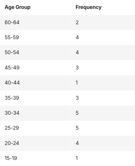
Grouped Frequency Distributions Tables
When you have a very large range of data values, especially with continuous data (like precise measurements of height or weight), listing every single unique score in a simple frequency table can be impractical. In such cases, a grouped frequency table is used, where data values are organized into intervals called 'classes'.
In these grouped tables: use 10-20 intervals, make intervals equal in width, and include all possible scores
visual:
e.g., If you’re looking at test scores out of 100, you might group them like this:
0–9
10–19
20–29
Each of those groups is an interval (it covers everything between two numbers).
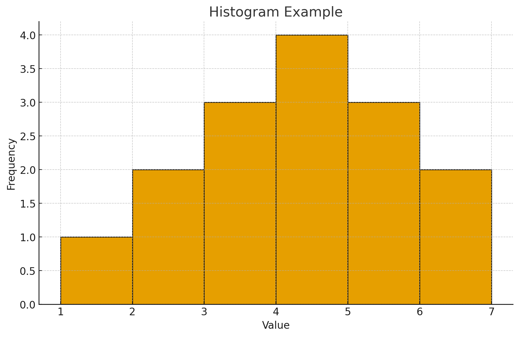
(Often paired with a histogram graphical display)
Classes Characteristics:
When creating a grouped frequency table, several guidelines ensure clarity and accuracy:
Class: This is a specific interval or range of values within which observations are grouped. For example, heights might be grouped into classes like "150-159 cm", "160-169 cm", etc.
Class width: This is the size or numerical span of each class interval. It's generally a best practice for all classes in a grouped distribution to have an equal width. For example, in the height example above, the class width is 10 cm for each interval.
Equal and closed: This is an important guideline for constructing grouped data. All class intervals should ideally have equal width to avoid distorting the appearance of the distribution.
Additionally, they should be "closed," meaning their endpoints are clearly defined and there's no ambiguity about which class a particular value belongs to.
^ For instance, if one class ends at 20, the next should start at 21 (for discrete data) or have proper real limits (for continuous data) to avoid overlaps or gaps.
Real limits: Are the true lower and upper boundaries of a class interval.
each interval has its whole number scores (e.g., for 10-14, whole #’s are 10,11,12,13,14), so each score stretches halfway up and halfway down
so score 10 covers 9.5 up to 10.5
for score 14 covers 13.5 and 14.5
In conclusion, for the interval 10-14, its real limits are 9.5 to 14.5
If there’s a score such as 9.37 or 9.26, it would fall under another interval group; that is why real limits are so precise.
ALSO, the 2nd real limit number in this example is 14.5, which is a cutoff, meaning not including 14.5, just up to 14.5. Super tedious but important in stats.
This acknowledges the continuous nature of the underlying data and helps in a precise graphical representation.
Graphical Representations of Frequency Distributions
Visualizing frequency distributions helps us quickly understand the patterns, spread, and shape of our data.
Histogram: This is a specialized bar graph used for interval or ratio scale (continuous) data. Histograms are excellent for showing the overall shape of the distribution.
The bars touch each other, indicating the continuous nature of the data along the horizontal axis.
The height of each bar represents the frequency(y-axis)/ scores(x-axis).
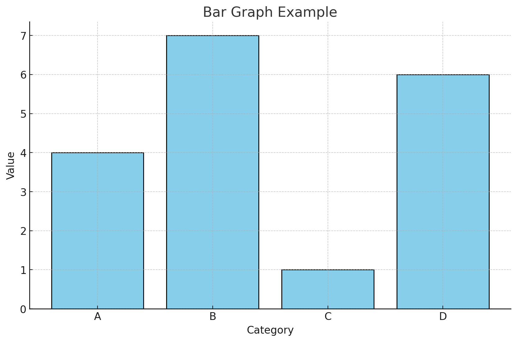
Bar graph: Used for discrete, nominal, or ordinal data (data that consists of separate categories).
The bars in a bar graph do not touch each other, emphasizing that the categories are distinct and separate
The height of each bar represents the frequency or proportion of observations in each category.
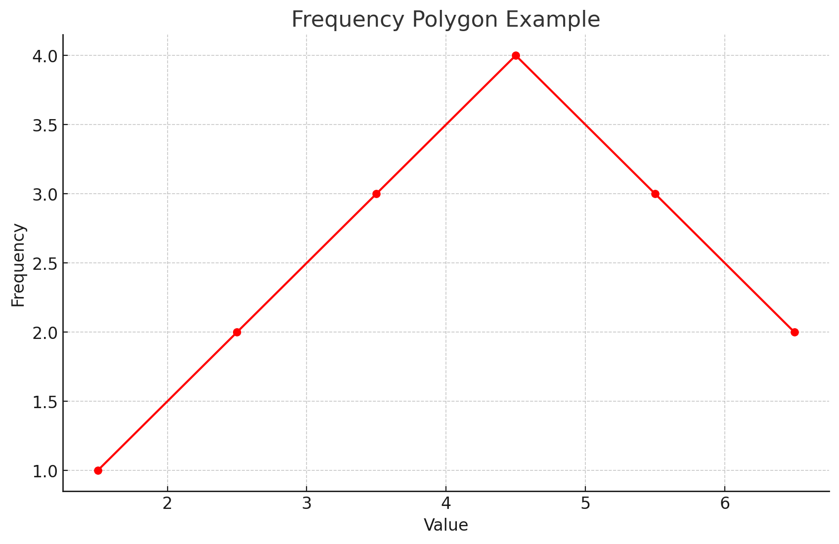
Frequency polygon: This is a line graph that provides an alternative way to visualize the shape of a distribution for interval/ratio data.
i.e., A frequency polygon is like a line-drawing version of a histogram.
It can be particularly useful for comparing the shapes of two or more different distributions on the same graph.
It's created by placing a dot at the midpoint of the top of each bar in a histogram (or the midpoint of each class interval frequency) and then connecting these dots with straight lines.
Characteristics of Distributed Data
Describing a distribution means understanding its key features, often referred to as its 'moments'.
Moments of a distribution: These are various statistical characteristics that provide crucial information about a distribution's shape and spread. The most common moments include:
Mean: The measure of the distribution's central tendency (its center).
Variance/Standard Deviation: Measures of the distribution's spread or variability (how much the data points differ from the mean).
Skewness: Describes the asymmetry of the distribution.
Kurtosis: Describes the peakedness or flatness of the distribution.
Modality: Describes the number of peaks in the distribution (e.g., unimodal, bimodal).
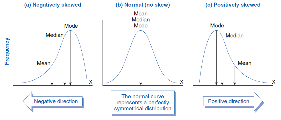
Skew: measures the asymmetry(lack if symmetry) of a probability distribution around its central point. (i.e. Skewness shows whether a distribution is symmetric or skewed to one side. It measures the direction and extent to which data values stretch more to the left or right of the center.)
An ideal symmetrical distribution (like a normal distribution) has no skew. However, many real-world distributions are skewed:
Skewness is important because it reveals how the data points are spread around the mean & It helps identify the presence of outliers, which are extreme values that pull the mean in a particular direction.
remember when looking at skewness on the graph that the x-axis is going from smaller numbers to bigger numbers left to right.
Positive Skew (Right-skewed): The tail of the distribution extends to the right. This often means there are a few very high values that pull the mean towards the higher end, while most values are clustered at the lower end. Example: Income distribution, where most people earn less, but a few earn a lot.
i.e. there are many more smaller numbers than higher numbers.
Negative Skew (Left-skewed): The tail of the distribution extends to the left. This usually indicates that a few very low values
i.e. there are many more bigger numbers than there are smaller numbers.
Zero/no skew: there is a perfectly balanced distribution on both sides. This occurs in a normal distribution/ bell curve.